| Author | Thread |
Comments Made During the Challenge  |
|
|
06/20/2003 03:56:34 PM |
|
|
|
06/19/2003 03:46:33 PM |
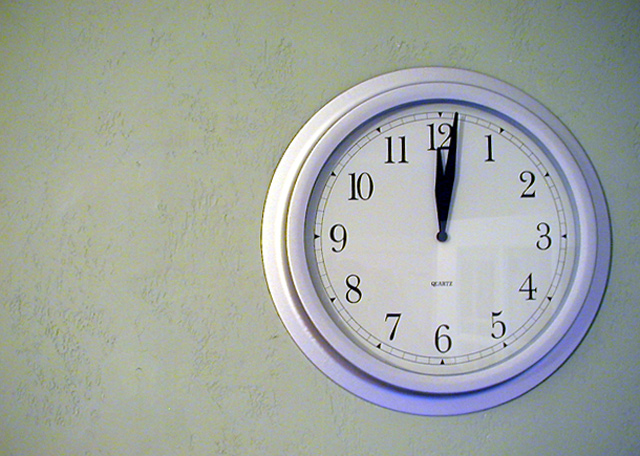
| The clock is off-center, and the picture is clear, but IMO it's not really a picture that will catch people's attention. The door (or window) reflected on the clock is distracting. Also IMO, the picture might be a bit better if the three small sides (bottom, right, and top) were the same size. ~4 |
|
|
|
06/16/2003 07:29:06 PM |
| I don't really feel the off-centeredness of this subject adding anything to the photo. Might help to get closer to the wall and shoot across the clock instead of straight at it. As it is, this image doesn't really say a lot, in my opinion. Maybe because everything about it is formal except the extra white space on the left? |
|
|
|
06/16/2003 03:43:45 PM |
| A nice idea but a bit of a bland backdrop. The blue light is nice, maybe if this was seen more on the wall itself? |
|
|
|
06/16/2003 03:39:12 PM |
| Fits the topic but a little bland. |
|
|
|
06/16/2003 02:06:38 PM |
| I like the window/door reflection in the clock. |
|
|
|
06/16/2003 10:21:47 AM |
| Nice & sharp & simple... although perhaps not the most exciting of subjects. There seems to be a little excessive grain (just a teeny bit), and the reflection in the clock is a little distracting. |
|
|
|
06/16/2003 04:57:19 AM |
| Nice concept. Great textures, lighting, colours. 9 |
|
|
|
06/16/2003 02:32:27 AM |
| Ive seen photos like this before but its a good picture nontheless. 7 |
|
Home -
Challenges -
Community -
League -
Photos -
Cameras -
Lenses -
Learn -
Help -
Terms of Use -
Privacy -
Top ^
DPChallenge, and website content and design, Copyright © 2001-2025 Challenging Technologies, LLC.
All digital photo copyrights belong to the photographers and may not be used without permission.
Current Server Time: 03/12/2025 09:36:01 AM EDT.