| Author | Thread |
Comments Made During the Challenge  |
|
|
11/06/2005 11:15:54 PM |
Returning for comments:
Nice composition. |
|
 Photographer found comment helpful. Photographer found comment helpful. |
|
|
11/06/2005 03:43:37 PM |
| the empty space hurts this IMO - would love to see it cropped to just the distortion |
|
| Photographer found comment helpful. |
|
|
11/06/2005 05:05:48 AM |
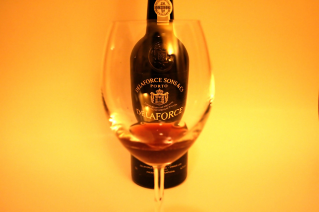
| I like way you have changed the shape of the bottle, with its waist it became a feminin port! |
|
| Photographer found comment helpful. |
|
|
11/02/2005 12:15:04 PM |
| I think that the lighting and background are well done, although the more I look at this, the more I wish that the glass were in sharper focus. Probably very difficult to achieve, though. |
|
| Photographer found comment helpful. |
|
|
11/01/2005 05:19:34 PM |
|
| Photographer found comment helpful. |
|
|
10/31/2005 08:05:30 PM |
The good: Nice idea and the coloring works with the subject
To work on: The glass' focus or position causes a weird shape which is distracting. Lighting a glass from the front is always a challenge in this type of photography. |
|
| Photographer found comment helpful. |
|
|
10/31/2005 07:49:10 PM |
| mmm...port! like the warm tone for the background as well. |
|
| Photographer found comment helpful. |
|
|
10/31/2005 11:04:12 AM |
I like porto, and the distorted bottle is really clear and has an interesting shape, but perhaps a colour other than orange/yellow could have been chosen for the backgroud? It's so bold, it almost overpowers.
nitpick: way off to the left by the border there seems to be a little extra line (missed when cloning out??) |
|
| Photographer found comment helpful. |
|
|
10/31/2005 08:00:30 AM |
| A good idea. I like how the bottle looks through the glass. For me, I would have cropped this closer to your subjects though. Both objects are vertical, but your frame is a horizontal. To me, that makes it look kind of..."squished" - whereas changing this to portrait (or vertical) would enhance. |
|
| Photographer found comment helpful. |
Home -
Challenges -
Community -
League -
Photos -
Cameras -
Lenses -
Learn -
Help -
Terms of Use -
Privacy -
Top ^
DPChallenge, and website content and design, Copyright © 2001-2025 Challenging Technologies, LLC.
All digital photo copyrights belong to the photographers and may not be used without permission.
Current Server Time: 03/12/2025 03:15:05 AM EDT.