| Author | Thread |
|
|
06/30/2002 11:21:00 AM |
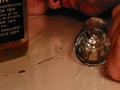
| Thanks for all of your comments. Uh, I think it needed a little more, oh I don't know, CONTRAST. For my first entry, I'll take the 4.3. |
|
Comments Made During the Challenge  |
|
|
06/22/2002 05:24:00 PM |
| Nice idea, but poorly executed. Not sure if black and white fits it. Try to alter your lighting for a more dramatic effect. |
|
|
|
06/21/2002 05:14:00 PM |
|
|
|
06/21/2002 02:50:00 PM |
| I like the idea behind this.. but maybe could use just a little more contrast. |
|
|
|
06/20/2002 01:52:00 AM |
| You made me have to look real hard for the shadows...but that's OK. Nice shot. I like the trunk-like composition as well. |
|
|
|
06/20/2002 01:30:00 AM |
| took me a minute to figure it out.. but I like it.. I think it needs more contrast though |
|
|
|
06/19/2002 05:25:00 PM |
|
|
|
06/19/2002 04:27:00 PM |
|
|
|
06/19/2002 03:21:00 PM |
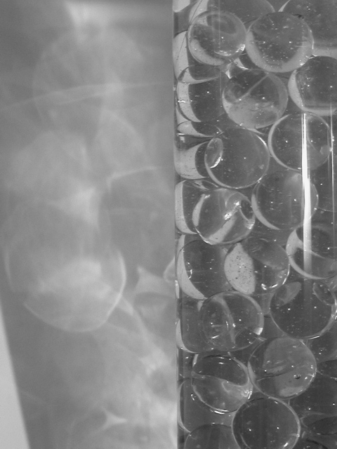
| Very nice shadows! i think this would have also been nice with some colored lighting possibly :) The could have also produce some neat effects if lit by candle. The only flaw I see that really catches my eye is the diagonal shadow line across the lower left of the frame. Maybe a tighter crop? Good work! - jmsetzler |
|
|
|
06/19/2002 12:12:00 PM |
| I like this photo; shapes and lighting effects. Did you experiment with placing the "divider" somewhere other than the middle of the photo? It seems a little too symetrical to place this so close to the middle... |
|
|
|
06/19/2002 08:08:00 AM |
| a little less contrast for my taste. |
|
|
|
06/18/2002 11:39:00 PM |
| I like the play of the light as it's reflected through the marbles. The 'carpers' are probably asking where the shadow is but it works for me. |
|
|
|
06/18/2002 07:37:00 PM |
| More contrast is needed--everything looks washed out and dull. |
|
|
|
06/18/2002 04:46:00 PM |
| I don't like the way this is divided in the middle, sorry. |
|
|
|
06/18/2002 01:22:00 PM |
|
|
|
06/17/2002 06:17:00 PM |
| Grrrrrrrrrrrrrrraaaaaaaaaaaaaaaaaaaaaaaaaaayyyyyyyyyyyyyyyyyyyyyy!!!!!!!! |
|
|
|
06/17/2002 02:56:00 PM |
| I see where you are trying to go with this one, but unfortunately, this is very much a gray on gray shot. Some more contrast, and maybe a stronger lightsource could've helped IMO. |
|
|
|
06/17/2002 01:13:00 AM |
| More of a refraction image than "shadow" to me. |
|
Home -
Challenges -
Community -
League -
Photos -
Cameras -
Lenses -
Learn -
Help -
Terms of Use -
Privacy -
Top ^
DPChallenge, and website content and design, Copyright © 2001-2025 Challenging Technologies, LLC.
All digital photo copyrights belong to the photographers and may not be used without permission.
Current Server Time: 03/12/2025 09:47:54 PM EDT.