| Author | Thread |
|
|
11/22/2005 05:21:20 PM |
| oh wow.. i can't believe the placing on this.. this is first class... congrats on fantastic shot.. deserves a lot higher... like ribbon... |
|
 Photographer found comment helpful. Photographer found comment helpful. |
Comments Made During the Challenge  |
|
|
11/18/2005 07:39:32 PM |
| Very impressive, I especially like the amount of detail you were able capture given the low light. |
|
| Photographer found comment helpful. |
|
|
11/18/2005 05:37:19 PM |
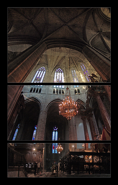
| nice expression of gothic verticality. the non-alignment of lines is a bit bothersome though. overall good, anyhow. on second thoughts this is one of the few that actually uses 3 different angles on the same subject for the triptych and and you succeed quite well, so I'll rethink and bump you up to 9 |
|
| Photographer found comment helpful. |
|
|
11/18/2005 04:32:21 AM |
| i really hope its 3 different pictures! so simple, and so effective. Recreating an illusion that no lens could reproduce without serious barrel distortion. great! 8 (because the colors dont match from top and middle frames) |
|
| Photographer found comment helpful. |
|
|
11/17/2005 11:19:27 PM |
| this is good. i wish i thought of it - i've pieced stuff together like this but never thought of it for the challenge. very nice work. 7 .. no.... 8 |
|
| Photographer found comment helpful. |
|
|
11/15/2005 10:32:01 PM |
| terrific perspective of strking architecture. I like your use of the decreasing frame sizes which empasizes the souring space overhead. |
|
| Photographer found comment helpful. |
|
|
11/15/2005 10:06:33 PM |
| Really a very stunning shot. I'd prefer the segments to be equal, though, rather than decreasing in size. I'd like to see it as a whole picture after the challenge ends. |
|
| Photographer found comment helpful. |
|
|
11/15/2005 06:43:55 PM |
|
| Photographer found comment helpful. |
|
|
11/15/2005 04:57:37 PM |
| Interesting shot, I found myself liking it more each time I came back to view it. Works well as a triptych, which I think enhances the sense of scale. |
|
| Photographer found comment helpful. |
|
|
11/15/2005 11:45:53 AM |
| This shot is beautiful. Good Luck. |
|
| Photographer found comment helpful. |
|
|
11/15/2005 02:50:09 AM |
| Excellent photo, the angle and granduer is well exhibited and enhanced by the triptych. |
|
| Photographer found comment helpful. |
|
|
11/14/2005 09:31:09 PM |
| Dynamite choice of how to segment this, great composition. |
|
| Photographer found comment helpful. |
|
|
11/14/2005 08:45:15 PM |
| I like it. The expanse of the ceiling is an excellent shot. I think the triptych nature helps because I think you recomposed for the top shot to aim more up. You did quite well with the lighting of what could be a difficult subject (between the lights of the windows and the darks of the ceiling.) 8 |
|
| Photographer found comment helpful. |
|
|
11/14/2005 06:24:57 PM |
Like the way the angles don't quite meet, which shows the image is not just a single shot split up into three. I think you might have made that feature a little more prominent.
I lik ethis image, reminds me of Ely Cathederal, but I guess it could be any of the Great Cathederals. |
|
| Photographer found comment helpful. |
|
|
11/14/2005 11:06:50 AM |
At first this looked to me like one image cut into thirds. It is not. Or is it?
|
|
| Photographer found comment helpful. |
|
|
11/14/2005 08:21:20 AM |
| Very good concept and well taken |
|
| Photographer found comment helpful. |
|
|
11/14/2005 03:43:47 AM |
| Not a fan of the triptych treatment for such an awesome shot. Major kudos on the shot though! |
|
| Photographer found comment helpful. |
|
|
11/14/2005 03:08:52 AM |
| I can't see that the separations add anything to t his picture, and there doesn't seem to be any rhyme nor reason to them. The upper one breaks up the beautiful stained glass windows. |
|
| Photographer found comment helpful. |
|
|
11/14/2005 12:27:04 AM |
Fit Challenge Criteria: 2/2
Contrast/Color: 2/2
Composition: 2/2
Photo Quality: 2/2
My Subjective Affinity: 2/2
This is a great shot. Your exposure here is brilliant! This definitely deserves at least top ten! Great work! |
|
| Photographer found comment helpful. |
Home -
Challenges -
Community -
League -
Photos -
Cameras -
Lenses -
Learn -
Help -
Terms of Use -
Privacy -
Top ^
DPChallenge, and website content and design, Copyright © 2001-2025 Challenging Technologies, LLC.
All digital photo copyrights belong to the photographers and may not be used without permission.
Current Server Time: 04/28/2025 03:22:40 AM EDT.