| Author | Thread |
|
|
05/01/2007 05:54:20 PM |
| the blah blah blah was the key. enjoyed. |
|
|
|
11/26/2005 03:43:04 PM |
Hello from the Critique Club!
I have studied your image and have the following to offer:
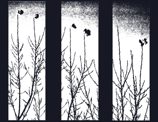
Composition/perspective � I am not sure about your choice of sizing/spacing on the panels. When I look at it I get the feeling I am looking through a barred window rather than at a triptych image. The center and side divisions are a little wide compared to the top and bottom borders. With the processing it is hard to tell about focus or too many image properties themselves. The starkness of the image helps support your subjects which are otherwise a little uninteresting. The division is also a little distracting. The branches don�t line up from panel to panel and the eye naturally tries to do this. This indicates to me the image was not simply split, but cropped three different times and/or more than one perspective was used. I think this is one element that weakens the image as a whole - the right edge of panel one and left edge of panel two are the same yet the perspective is not quite the same. With a lack of detail and/or color to make up for/hide or otherwise distract from this disparity, I find it confusing to look at for very long. There is just not enough to grab the attention to make up for this.
Color � b/w, solid black and bright white, not may shades of gray except in the top. The white is a little bright in the center of all three panels. The brightness starts to wash over the black branches. It totally distorts the leaves(?) at the top making some of them appear detached.
Lighting � very hard to tell with this image. The processing has hidden most details of the image that would help here.
Challenge requirements � by definition this meets the challenge requirements. However, the processing � the wide divisions � make this appear more as though you are looking at three similar images meant to be viewed separately as opposed to a triptych image.
Overall/my opinion � the weakest part of this image is the processing. It takes away any character the branches and/or leaves may have had on their own. The sky texture looks totally created and not natural at all. The bright white takes detail and definition away while making the outlines appear rougher than they probably are. The separation between panels is a bit wide and gives a heavy appearance to the shot.
|
|
 Photographer found comment helpful. Photographer found comment helpful. |
Comments Made During the Challenge  |
|
|
11/17/2005 01:35:37 PM |
| interesting concept, just a little too contrasty for my taste |
|
|
|
11/16/2005 07:17:18 PM |
|
|
|
11/15/2005 08:16:21 PM |
| i like it, but not as much as i would if it looked more like an actual photo. (maybe less saturation/threshold) i'm not quite sure what you used. well done nonetheless. 7 |
|
| Photographer found comment helpful. |
|
|
11/14/2005 09:45:06 PM |
| I like it. Has a moody feel to it. I'm guessing most of the voters won't agree with me, though. I hope I'm wrong. |
|
| Photographer found comment helpful. |
|
|
11/14/2005 12:03:35 PM |
Artsy, I like it. Probably one of the very few 10(s) :(
|
|
| Photographer found comment helpful. |
|
|
11/14/2005 10:11:20 AM |
| Maybe too graphic for me... |
|
| Photographer found comment helpful. |
|
|
11/14/2005 05:05:14 AM |
| One of the very best, out of the many triptychs I've seen today. I'd give a ribbon to you for this superb compilation. Well done. |
|
| Photographer found comment helpful. |
|
|
11/14/2005 01:36:15 AM |
| It's artistic, but it's maybe a little over-processed. to the point where it's hard initially to tell what I'm looking at. Still, it would look good on the wall. |
|
| Photographer found comment helpful. |
Home -
Challenges -
Community -
League -
Photos -
Cameras -
Lenses -
Learn -
Help -
Terms of Use -
Privacy -
Top ^
DPChallenge, and website content and design, Copyright © 2001-2025 Challenging Technologies, LLC.
All digital photo copyrights belong to the photographers and may not be used without permission.
Current Server Time: 03/14/2025 01:14:19 PM EDT.