| Author | Thread |
Comments Made During the Challenge  |
|
|
11/16/2005 12:43:55 PM |
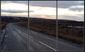
| The focus seems a little off and the highlights are a bit blown out. Honestly I don't think this image lends itself very well to a triptych. There is no natural separation where you have chosen to break the image and the gray/brown background doesn't help either. |
|
 Photographer found comment helpful. Photographer found comment helpful. |
|
|
11/15/2005 11:55:10 AM |
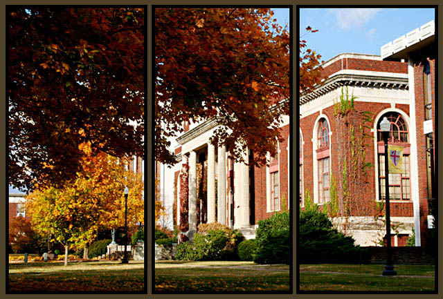
| How does the division of your picture into three frames enhance the photo? How does this "tell...a story or illustrates a concept or object" better than the original image? |
|
| Photographer found comment helpful. |
|
|
11/14/2005 10:45:40 PM |
| i love this shot, maybe a little more focus in the middle? 8 |
|
| Photographer found comment helpful. |
|
|
11/14/2005 06:19:19 PM |
| There is something distracting about the gold border in conjunction with the black. I like the photo though. |
|
| Photographer found comment helpful. |
|
|
11/14/2005 11:22:13 AM |
I know this meets the challenge, but I am not a big fan on just cutting up one nice shot into 3 with distracting borders. Seems too easy, no real creativity required.
Also seems over sharpened. |
|
| Photographer found comment helpful. |
|
|
11/14/2005 09:15:44 AM |
| I think you made a bad choice of that filler color for the frame, otherwise good composition and nice fall colors. |
|
| Photographer found comment helpful. |
|
|
11/14/2005 07:50:23 AM |
| This looks great in a triptich format. I love the autumn feelto it. It may be just a bit over-exposed on the building, but I really love it anyway. Good luck. |
|
| Photographer found comment helpful. |
Home -
Challenges -
Community -
League -
Photos -
Cameras -
Lenses -
Learn -
Help -
Terms of Use -
Privacy -
Top ^
DPChallenge, and website content and design, Copyright © 2001-2025 Challenging Technologies, LLC.
All digital photo copyrights belong to the photographers and may not be used without permission.
Current Server Time: 03/14/2025 09:36:17 AM EDT.