| Author | Thread |
|
|
11/27/2005 10:26:16 PM |
Greetings from the Critique Club
Composition:
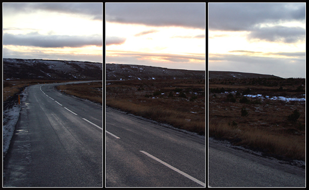
Good composition and falls exactly in the Rules of Thirds both horizontally and vertically.
Subject:
This image lacks a visual interest. The path of your country road is strong and is a great candidate for leading lines. However, as the viewer's eye traverses this path, there is nothing for me to focus on. My eye is led past the frame.
Post-processing:
I think you can adjust the levels a bit more to saturate the color of the road and bring a bit of color to the grass and weeds. I think a bit of burning would do wonders for the sky. Since this was an advanced challenge, you can select the sky and bump the color saturation so it doesn't appear to be too overcast.
My Final Thoughts:
Personally, I think that this image has a lot of potential behind it. The lack of a "subject" might be where the pitfall of this image comes in. With the expectation sof DPCers set at a fairly high mark, this shot appears to "snapshot" for some probably.
This image meets the challenge in my opinion and your title is on the mark.
If you have any questions about this critique, please feel free to contact me via the PM system.
Rikki
|
|
 Photographer found comment helpful. Photographer found comment helpful. |
Comments Made During the Challenge  |
|
|
11/17/2005 05:29:45 PM |
| Interesting composition, it appears that the horizon is slanting because of the terrain and camera angle. |
|
| Photographer found comment helpful. |
|
|
11/17/2005 03:37:33 PM |
| There doesn't seem to be a reason to have 3 panels except to meet the challenge. |
|
|
|
11/16/2005 06:47:10 PM |
| The triptych isn't adding a lot here. |
|
| Photographer found comment helpful. |
|
|
11/16/2005 04:19:35 PM |
| feel like I should know this place...... |
|
| Photographer found comment helpful. |
|
|
11/15/2005 10:29:27 PM |
| I think this photo works okay as divided but for me lacks a point of interest. |
|
| Photographer found comment helpful. |
|
|
11/15/2005 11:23:41 AM |
| How does the division of your picture into three frames enhance the photo? How does this "tell...a story or illustrates a concept or object" better than the original image? |
|
|
|
11/15/2005 10:55:13 AM |
| I like this one. I think it fits the triptich format very well. It adds interest and pop. |
|
| Photographer found comment helpful. |
|
|
11/14/2005 12:55:17 AM |
| pretty picture, but IMO it doesn't naturally lend itself to the division into three parts. |
|
| Photographer found comment helpful. |
|
|
11/14/2005 12:34:53 AM |
Fit Challenge Criteria: 2/2
Contrast/Color: 1/2
Composition: 2/2
Photo Quality: 1/2
My Subjective Affinity: 1/2
Nice composition here. I like the darker effect with a wet road. Good work. |
|
| Photographer found comment helpful. |
Home -
Challenges -
Community -
League -
Photos -
Cameras -
Lenses -
Learn -
Help -
Terms of Use -
Privacy -
Top ^
DPChallenge, and website content and design, Copyright © 2001-2025 Challenging Technologies, LLC.
All digital photo copyrights belong to the photographers and may not be used without permission.
Current Server Time: 03/14/2025 06:04:31 AM EDT.