| Author | Thread |
Comments Made During the Challenge  |
|
|
11/19/2005 08:17:55 PM |
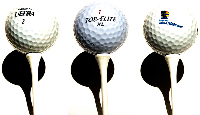
| I like the high contrast, though I'm not sure if that feeling is universal. I think I might like it better without the harsh shadows, with a bit more empty space on top, and maybe with the tees more precisely vertical. Nice concept though, and overall a great job! |
|
 Photographer found comment helpful. Photographer found comment helpful. |
|
|
11/17/2005 01:42:54 PM |
| This doesn't seem to be a true triptych and it's awfully contrasty. |
|
| Photographer found comment helpful. |
|
|
11/15/2005 08:22:01 PM |
| i like, but the shadows in the back distract from the picture as a whole. 6 |
|
| Photographer found comment helpful. |
|
|
11/15/2005 01:30:17 PM |
| Slightly overexposed, to my personal taste... |
|
| Photographer found comment helpful. |
|
|
11/14/2005 03:26:13 PM |
| I like the concept but I think each ball has a little over exposed area at the top. |
|
| Photographer found comment helpful. |
|
|
11/14/2005 12:33:30 AM |
| Well-done! Clean and original. |
|
| Photographer found comment helpful. |
Home -
Challenges -
Community -
League -
Photos -
Cameras -
Lenses -
Learn -
Help -
Terms of Use -
Privacy -
Top ^
DPChallenge, and website content and design, Copyright © 2001-2025 Challenging Technologies, LLC.
All digital photo copyrights belong to the photographers and may not be used without permission.
Current Server Time: 03/14/2025 06:08:43 AM EDT.