| Author | Thread |
|
|
02/04/2006 07:59:38 PM |
| i think this is excellent and i quite like the distortion. nice work! |
|
 Photographer found comment helpful. Photographer found comment helpful. |
Comments Made During the Challenge  |
|
|
11/20/2005 07:01:12 PM |
| I'm afraid the stetching of these images does not flatter them. |
|
| Photographer found comment helpful. |
|
|
11/17/2005 09:16:50 PM |
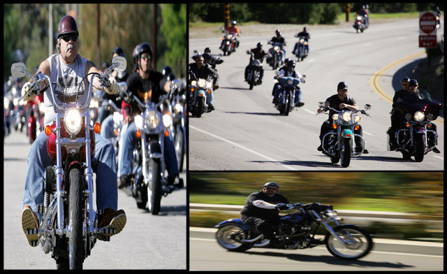
| Great trio of photos! They ,however, seem strecthed and squeezed a bit. Still a theme close to my heart. |
|
| Photographer found comment helpful. |
|
|
11/16/2005 07:15:42 PM |
| This is cool almost easy rider |
|
|
|
11/15/2005 02:29:09 PM |
| the left pane and bottom seem to be suffering from distortion, the left one squeesed and the bottom one stretched. |
|
| Photographer found comment helpful. |
|
|
11/15/2005 12:07:27 PM |
| great images, the only critisim I have is watch how you are making things fit into your boxes....the image on the left looks dis proportioned (sp?) other than that great subject matter and lighting looks ok. I think overall an 8, could have been a 9. keep shooting! :) |
|
| Photographer found comment helpful. |
|
|
11/15/2005 05:13:41 AM |
| These look like they have been squashed and stretched into the frames. |
|
| Photographer found comment helpful. |
|
|
11/15/2005 03:15:37 AM |
| Great photos & well composed. |
|
|
|
11/14/2005 09:03:42 PM |
| i like but the pictures seem a little blurry and way to thin for what they should be. 6 |
|
| Photographer found comment helpful. |
|
|
11/14/2005 06:44:43 PM |
|
| Photographer found comment helpful. |
|
|
11/14/2005 06:01:13 PM |
| great idea ..just a little too much distorsion and stretching out of proportion |
|
| Photographer found comment helpful. |
|
|
11/14/2005 12:52:46 PM |
| the photos are too distorted...otherwise a good concept |
|
| Photographer found comment helpful. |
|
|
11/14/2005 10:49:49 AM |
| This would have been GREAT, but something is wrong with the resizing??? Everything looks like it's shaped wrong. |
|
| Photographer found comment helpful. |
|
|
11/14/2005 02:31:35 AM |
| I like the idea, but the squeezed/stretched images... I dunno. |
|
| Photographer found comment helpful. |
|
|
11/14/2005 01:07:54 AM |
| Cool pictures and concept. Not sure if I like the loss of proportion on the left and lower pictures (although the lower one is better, as it enhances the illusion of speed). |
|
| Photographer found comment helpful. |
Home -
Challenges -
Community -
League -
Photos -
Cameras -
Lenses -
Learn -
Help -
Terms of Use -
Privacy -
Top ^
DPChallenge, and website content and design, Copyright © 2001-2025 Challenging Technologies, LLC.
All digital photo copyrights belong to the photographers and may not be used without permission.
Current Server Time: 03/14/2025 01:39:33 AM EDT.