| Author | Thread |
Comments Made During the Challenge  |
|
|
11/20/2005 10:49:52 PM |
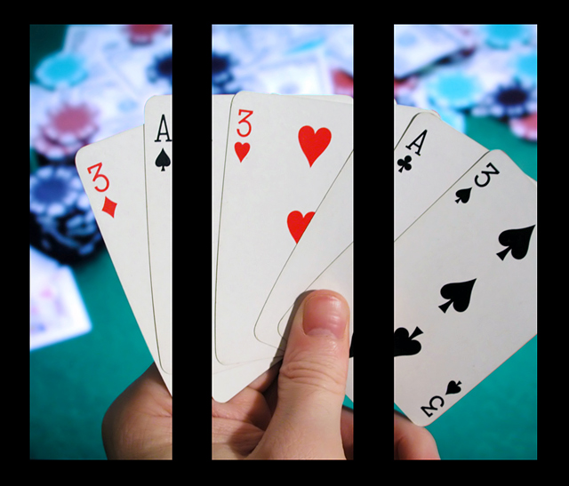
| Like the super sharpness in the foreground and the blurred chips and cards in the background. Neat shot. |
|
 Photographer found comment helpful. Photographer found comment helpful. |
|
|
11/20/2005 05:57:52 PM |
| I think this would have looked better with less space between the panels. |
|
| Photographer found comment helpful. |
|
|
11/17/2005 03:44:13 PM |
| title says trips but it looks more like a boat to me. :) |
|
| Photographer found comment helpful. |
|
|
11/17/2005 09:54:55 AM |
|
| Photographer found comment helpful. |
|
|
11/16/2005 07:43:16 PM |
|
| Photographer found comment helpful. |
|
|
11/15/2005 04:43:15 PM |
| hmmm, those are thick bars. :) Looks like I'm playing from jail. Is there a color cast to the background? |
|
| Photographer found comment helpful. |
|
|
11/15/2005 11:42:04 AM |
| That looks awesome. I'm sure someone's already mentioned it, but I wonder if the cards in panels 2 & 3 lined up if it would give it just another added punch. But it looks great anyway, and I really like it! |
|
| Photographer found comment helpful. |
|
|
11/15/2005 11:19:52 AM |
| How does the division of your picture into three frames enhance the photo? How does this "tell...a story or illustrates a concept or object" better than the original image? |
|
| Photographer found comment helpful. |
|
|
11/15/2005 03:21:42 AM |
| Nice, clean compositon and a good choice of subject matter. |
|
| Photographer found comment helpful. |
|
|
11/15/2005 03:01:28 AM |
| Great lighting and colors on this shot. The choice of cards in the hand makes this viable as a triptych...good call. Very nice shot! |
|
| Photographer found comment helpful. |
|
|
11/14/2005 11:20:48 PM |
| This would have been very nice if the cards in the middle frame linded up |
|
| Photographer found comment helpful. |
|
|
11/14/2005 11:03:58 PM |
|
| Photographer found comment helpful. |
|
|
11/14/2005 01:32:25 PM |
|
| Photographer found comment helpful. |
|
|
11/14/2005 11:07:49 AM |
| I know this meets the challenge, but I am not a big fan on just cutting up one nice shot into 3 with distracting borders. Seems too easy, no real creativity required. Also the borders seem way too thick. |
|
| Photographer found comment helpful. |
|
|
11/14/2005 02:53:14 AM |
| Too heavy on the border and the shot doesn't seem to lend itself well to being split up. Otherwise a good photo - do it again with 5 aces for the latest member challenge. ;-) |
|
| Photographer found comment helpful. |
Home -
Challenges -
Community -
League -
Photos -
Cameras -
Lenses -
Learn -
Help -
Terms of Use -
Privacy -
Top ^
DPChallenge, and website content and design, Copyright © 2001-2025 Challenging Technologies, LLC.
All digital photo copyrights belong to the photographers and may not be used without permission.
Current Server Time: 03/12/2025 02:08:49 PM EDT.