| Author | Thread |
|
|
07/13/2006 01:38:15 PM |
great shot of my hometown! check out my version of the bridge that is in the left of your picture...

Message edited by author 2006-07-13 13:42:56. |
|
 Photographer found comment helpful. Photographer found comment helpful. |
|
|
06/29/2006 07:28:40 PM |
|
| Photographer found comment helpful. |
Comments Made During the Challenge  |
|
|
11/20/2005 11:56:07 AM |
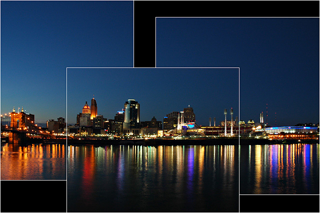
| The composition of the 3 frames is just an excellent work of art. Very creative. |
|
| Photographer found comment helpful. |
|
|
11/20/2005 02:10:30 AM |
Creative use of non-symmetrical framing.
Very clear and shot at just the right time - the blue hour. (7) |
|
| Photographer found comment helpful. |
|
|
11/17/2005 10:36:45 PM |
| Interesting layout and wonderful colours in the reflections. I think the bottom of the first image is not high enough. To me it's just a little to close to the bottom of the third giving the impression of being sloppy rather than intentional. The current crop probably wouldn't lend itself to changing that though. |
|
| Photographer found comment helpful. |
|
|
11/17/2005 05:28:19 PM |
| Creative photo, I like the use of images that is not just splitting the area into three equal parts, I see this in the top 10. |
|
| Photographer found comment helpful. |
|
|
11/17/2005 04:44:54 PM |
| well put together and interesting reflections. |
|
| Photographer found comment helpful. |
|
|
11/17/2005 09:54:34 AM |
|
| Photographer found comment helpful. |
|
|
11/17/2005 03:33:19 AM |
| Great nightscape, framing is really different, I like it! |
|
| Photographer found comment helpful. |
|
|
11/16/2005 10:43:45 PM |
| Well done, nicely ligned up. |
|
| Photographer found comment helpful. |
|
|
11/16/2005 08:49:19 PM |
|
| Photographer found comment helpful. |
|
|
11/16/2005 01:01:46 PM |
| I just voted another cityscape last picture. You did creative things with the panelling and I think that somewhat overcomes the weakness of having the outer panels unable to quite stand on their own. Nice blue in the sky. 7 |
|
| Photographer found comment helpful. |
|
|
11/16/2005 08:50:15 AM |
| Nice innovative layout. The black background and thin white outline really heps to enhance these images. Very nicely done!! Hope to see it reach the top. |
|
| Photographer found comment helpful. |
|
|
11/15/2005 07:12:39 PM |
| An interesting take on a triptych, I think I like it. Definitely a gorgeous shot. |
|
| Photographer found comment helpful. |
|
|
11/15/2005 11:51:45 AM |
| How does the division of your picture into three frames enhance the photo? How does this "tell...a story or illustrates a concept or object" better than the original image? |
|
|
|
11/15/2005 11:16:35 AM |
| I like the way these stitch together leaving a funky shaped border. Good Luck |
|
| Photographer found comment helpful. |
|
|
11/15/2005 10:58:28 AM |
| This is a very interesting format. I like how the scene lines up perfectly, but for interest, the panls do not. And the beautiful night shot with those amazing colors reflecting in the water don't hurt it either. |
|
| Photographer found comment helpful. |
|
|
11/15/2005 10:14:36 AM |
| I like the unusual placement of the shots. Great idea! |
|
| Photographer found comment helpful. |
|
|
11/14/2005 10:41:51 PM |
| This is my favorite of the skylines in this challenge because of the unique cropping. That sets it apart. Top ten from me. 9. |
|
| Photographer found comment helpful. |
|
|
11/14/2005 09:40:24 PM |
| very nice i really like the setup |
|
| Photographer found comment helpful. |
|
|
11/14/2005 07:01:03 PM |
| cool...I like the way you did your frames..!! 10 |
|
| Photographer found comment helpful. |
|
|
11/14/2005 06:25:54 PM |
| I like it. This a very different twist compared to most that I have seen. |
|
| Photographer found comment helpful. |
|
|
11/14/2005 04:28:17 PM |
| Love the arrangement of the panels - gives the overall picture a depth it might not have otherwise. |
|
| Photographer found comment helpful. |
|
|
11/14/2005 03:29:55 PM |
| Great job! I love the juxtaposition of the pictures to the skyline. Very cool. |
|
| Photographer found comment helpful. |
|
|
11/14/2005 03:20:04 PM |
| I like this idea. I think it might look better if there was a black border around the perimeter of the shots. |
|
| Photographer found comment helpful. |
|
|
11/14/2005 03:18:10 PM |
| Interesting placement of the border's and pictures in general. I probably would of cropped the three pictures to fit each other so it is a little more seamless and smooth. |
|
| Photographer found comment helpful. |
|
|
11/14/2005 03:41:17 AM |
|
| Photographer found comment helpful. |
|
|
11/14/2005 12:54:36 AM |
| Very clever overlapping of images. How'd you do that? Love the reflective quality. Great vivid colors. |
|
| Photographer found comment helpful. |
|
|
11/14/2005 12:23:16 AM |
|
| Photographer found comment helpful. |
Home -
Challenges -
Community -
League -
Photos -
Cameras -
Lenses -
Learn -
Help -
Terms of Use -
Privacy -
Top ^
DPChallenge, and website content and design, Copyright © 2001-2025 Challenging Technologies, LLC.
All digital photo copyrights belong to the photographers and may not be used without permission.
Current Server Time: 03/12/2025 08:35:09 AM EDT.