| Author | Thread |
|
|
05/06/2006 01:51:55 AM |
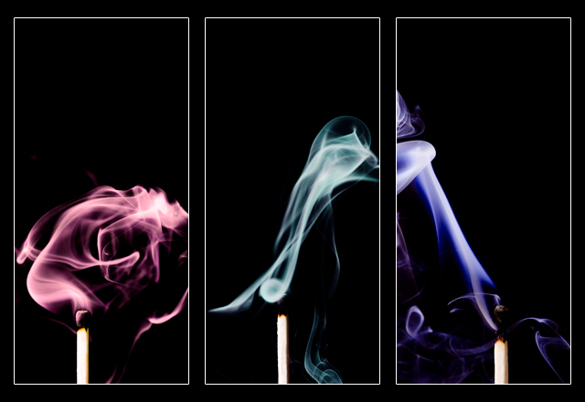
| I dig this shot. Smoke is hard to capture and you have done EddyG's image a great tribute. |
|
 Photographer found comment helpful. Photographer found comment helpful. |
|
|
11/23/2005 11:58:21 PM |
| Really cool looking image. Were they done with different color lights or colorized in PS? |
|
| Photographer found comment helpful. |
Comments Made During the Challenge  |
|
|
11/18/2005 01:45:47 PM |
| Excellent capture, a small thing, but it would have added impact to have the match in the same location in each frame. 9. |
|
| Photographer found comment helpful. |
|
|
11/17/2005 05:33:07 PM |
| good variation on that good ol' theme. I wish I could see more of the blue smoke, it seems to be the most interesting of the lot. /7 |
|
| Photographer found comment helpful. |
|
|
11/17/2005 10:23:47 AM |
|
| Photographer found comment helpful. |
|
|
11/16/2005 07:22:23 PM |
|
| Photographer found comment helpful. |
|
|
11/16/2005 12:52:06 PM |
| whew, when you try to reshoot a shot already done (EddyG) and a difficult one at that, it's hard not to compare. I think you know already this did not match (no pun) up. On it's own merit, the smoke is fairly well captured. The blue going off to the left is the weakest, the red is the strongest. |
|
| Photographer found comment helpful. |
|
|
11/15/2005 11:05:26 PM |
| Good set up for a triptych. The way the smoke is cut off feels a bit uncomfortable, though. |
|
| Photographer found comment helpful. |
|
|
11/15/2005 07:27:29 PM |
| Nice, good idea. Similar to what I did once. I know it would have been very difficult but this would have been way cool if the smoke from each photo had protruded into the adjacent photos. It would be a hard task I know, but I would have tried it. As it is though, super! |
|
| Photographer found comment helpful. |
|
|
11/15/2005 04:26:42 PM |
|
| Photographer found comment helpful. |
|
|
11/15/2005 11:40:02 AM |
| Very striking! These pictures of the colored smoke are so awesome. I really need to try that sometime! This looks great in a triptich format. Great job (of course). |
|
| Photographer found comment helpful. |
|
|
11/14/2005 11:44:02 PM |
| I'm a suker for a smoke shot (probably ibecause i cant do them myself). I personally would have dropped the title and put the red smoke in the middle since it is more blobby and the g and b taller. |
|
| Photographer found comment helpful. |
|
|
11/14/2005 10:36:40 PM |
| We've seen similar shots, but that doesn't make this any less stunning. |
|
| Photographer found comment helpful. |
|
|
11/14/2005 09:37:42 PM |
| wonderful pictures the colors are great |
|
| Photographer found comment helpful. |
|
|
11/14/2005 06:55:34 PM |
|
| Photographer found comment helpful. |
|
|
11/14/2005 01:07:57 PM |
|
| Photographer found comment helpful. |
|
|
11/14/2005 12:42:59 PM |
| Cool idea! But the tip of the match is hard to see. It took me a while to distinguish it from the background. |
|
| Photographer found comment helpful. |
|
|
11/14/2005 04:49:43 AM |
| Love the smoke! only critisism is that the matches are not crisp.IMHO |
|
| Photographer found comment helpful. |
|
|
11/14/2005 12:43:22 AM |
| I like this. It's a great idea, well carried out. The only thing that bothers me AT ALL is that the middle match looks to be a bit higher up in its frame than the other two. Otherwise, flawless. 9. |
|
| Photographer found comment helpful. |
|
|
11/14/2005 12:34:11 AM |
|
| Photographer found comment helpful. |
Home -
Challenges -
Community -
League -
Photos -
Cameras -
Lenses -
Learn -
Help -
Terms of Use -
Privacy -
Top ^
DPChallenge, and website content and design, Copyright © 2001-2025 Challenging Technologies, LLC.
All digital photo copyrights belong to the photographers and may not be used without permission.
Current Server Time: 04/28/2025 10:36:08 AM EDT.