| Author | Thread |
|
|
07/05/2003 08:17:46 AM |
Greetings from the Critique Club
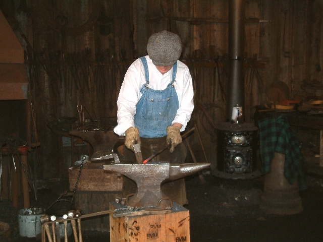
By Inspzil
Composition - This place looks like you could take a ton of pictures. There is cool stuff happening, neat tools, interesting atmosphere. Great choice of subjects is what I'm trying to say. Unfortunately in a place like this you can't set up lights and stuff to maximize the potential of your photos. The first thing I noticed is that the lighting looks like flash lighting, a little flat looking. The second thing I noticed was the angle of the shot. Dead on, centered, eye level, and landscape oriented. I see this shot being more successful shot portrait, from a lower vantage point, keeping the smith and the stove and the anvil as the 3 major things in the photo. I don't think there would be so much worry about what is in the background that way. And I also think that you really would've emphasized the smith better. Perhaps while he was swinging the hammer too... but that's starting to ask a lot. The white shirt is not helping matters one bit either. Light colored is definitely better for contrast. White is just a little too strong.
Technical - I think the exposure is about as good as you could hope for considering the circumstances. I'm guessing this place inside was fairly dark. Much brighter and you blow his shirt out. It seems pretty well focused to me. There weren't a lot of post shot adjustments, so nothing to worry about there.
Overall - You've found a great subject Jak. I'd have like to seen a little more creative approach to portraying this though. I won't for one second tell you I'm an expert at this, but as soon as I saw this picture, I was searching for an angle and perspective that would make the focus on this craftsman stronger. And that's not to say that you didn't take this from all angles. It may have been the case where those pics just didn't turn out as good as this one. Sometimes I have good ideas, sometimes I should learn when to keep my mouth shut. If I could differentiate between the 2 at any given time, I'd be an expert and probably a better photographer. But I'll lay it out like I'm seeing it. If it helps, I'm smiling and happy. If not, I'm still smiling and happy with you cursing me from a distance. Take care and best of luck Jak - Bob |
|
Comments Made During the Challenge  |
|
|
06/29/2003 03:01:33 PM |
| Interesting subject matter. Wish the background was exposed better so you could see all the tools and things on the wall. Alternatively, might have considered cropping to a vertical format centered around the guy working. I know lighting in a situation like this is tricky. |
|
|
|
06/28/2003 09:52:00 PM |
| Should have lit the background a little more, but the subject is good. Love that big metal anvil. |
|
|
|
06/27/2003 08:50:36 PM |
| Great light work on only the subject.....I like a tad more focus |
|
|
|
06/27/2003 11:26:00 AM |
| I like the colours of his shirt and contrast against the back but it's a shame we can't see his face - 7 |
|
|
|
06/25/2003 04:53:29 PM |
| Thanks for the email. I am glad I can vote on the techincal more accurately. I still think you should try opening aperture more and decrease shutter speed as you could catch movement of arm that way as well... |
|
|
|
06/24/2003 11:33:41 PM |
| I like the bright shirt against the muted background. The detail in the backgoruns is maintained well. A different composition could have added interest - maybe more of an angle rather than straight on and centered. |
|
|
|
06/23/2003 09:15:02 PM |
| I think the box in the front is a bit distracting from the main subject, consider cropping it out for greater impact. |
|
|
|
06/23/2003 12:43:42 PM |
| Great subject for this challenge. I really like how the background is dark and the guy is wearing a white shirt, that sets him apart nicely. I can still recognize the items in the background which add a nice context. The lighting is fine even though you have some highlights from the flash on the hammers in the bottom left, but that's not a big deal. The biggest single area of possible improvement would be in my mind to heed the lessons learned from the off-center challenge. The guy is almost right in the middle of the photo, I would have preferred a crop on either the left or right side (probably on the right just to the right of the fireplace, or a portrait crop to eliminate a lot more of the background. |
|
|
|
06/23/2003 12:52:03 AM |
| love your entry here, good over-all shot, would of liked to of seen just a tad more of his face, being the background is abit dark. and he would be your focal point. |
|
Home -
Challenges -
Community -
League -
Photos -
Cameras -
Lenses -
Learn -
Help -
Terms of Use -
Privacy -
Top ^
DPChallenge, and website content and design, Copyright © 2001-2025 Challenging Technologies, LLC.
All digital photo copyrights belong to the photographers and may not be used without permission.
Current Server Time: 03/14/2025 02:22:28 PM EDT.