| Author | Thread |
|
|
11/30/2005 10:30:26 AM |
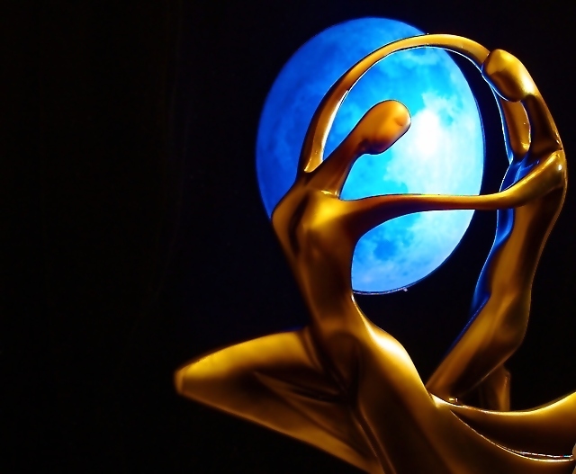
| Really beautifully composed shot. Love the colors too. I agree with the other commenters about the edges, but still a very nice job. |
|
 Photographer found comment helpful. Photographer found comment helpful. |
Comments Made During the Challenge  |
|
|
11/29/2005 10:56:44 PM |
| This could have been a '10' but I think you used too much USM, or some other sharpening tool, as the edges of the statue are glowing and ragged. Too bad, because it detracts heavily from the capture. |
|
| Photographer found comment helpful. |
|
|
11/29/2005 08:39:44 PM |
| A little more DOF would help. Edges look quite jagged, over sharpened or compression. I do like the composition and it is very eye catching. |
|
| Photographer found comment helpful. |
|
|
11/29/2005 12:24:10 PM |
|
|
|
11/29/2005 07:35:56 AM |
| strong image but the image in the background dosn't appear to be round so spoils the photo |
|
| Photographer found comment helpful. |
|
|
11/25/2005 09:13:00 PM |
| Awesome job, the placement is prefect. |
|
| Photographer found comment helpful. |
|
|
11/25/2005 05:33:52 PM |
| This is a beautiful concept and photo. I do wonder though if it was originally shot a little too soft and required excessive sharpening as the rounded edges have become jagged, particularly underneath the upper set of arms and the lower right portion of the gown. |
|
| Photographer found comment helpful. |
|
|
11/25/2005 12:26:30 PM |
| Rather surreal image, like the composition and colors |
|
| Photographer found comment helpful. |
|
|
11/24/2005 01:51:10 AM |
| This is very well done as far as balance and lighting. |
|
| Photographer found comment helpful. |
|
|
11/23/2005 05:17:43 PM |
| This is my second look and I've decided to change the score that I had originally cast to a (9). I really like the colors and the use of negative space. Good job! |
|
| Photographer found comment helpful. |
|
|
11/23/2005 02:45:03 PM |
|
| Photographer found comment helpful. |
|
|
11/23/2005 10:20:13 AM |
i love it
i have the same statue ;) |
|
| Photographer found comment helpful. |
|
|
11/23/2005 12:43:45 AM |
| Nice positioning of light souce and sculpture - similar curvature is great. Lower sharp edge of light oval is distracting, could be improved by putting it beyond the depth of field. Very pleasing overall. |
|
| Photographer found comment helpful. |
Home -
Challenges -
Community -
League -
Photos -
Cameras -
Lenses -
Learn -
Help -
Terms of Use -
Privacy -
Top ^
DPChallenge, and website content and design, Copyright © 2001-2025 Challenging Technologies, LLC.
All digital photo copyrights belong to the photographers and may not be used without permission.
Current Server Time: 03/12/2025 02:06:18 AM EDT.