| Author | Thread |
|
|
11/30/2005 06:19:28 PM |
Well I like it ... not quite as much as mine, but I like it :p
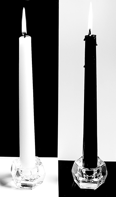
Really - this a great photo and deserved the early scores you got - not the angry-voter-scores from the end of voting. IMO - with a couple of advanced edits this is a wall hanger, basically just the definition of the flame on the black candle, spot edit some bright spots on black candle ... and I like the idea of black glass for white candle. Overall, imo, this is a well well well over 6 photo.
Now if you could incorporate Lexi somehow ... :) |
|
 Photographer found comment helpful. Photographer found comment helpful. |
Comments Made During the Challenge  |
|
|
11/29/2005 07:40:51 AM |
| dramatic and good balance |
|
| Photographer found comment helpful. |
|
|
11/28/2005 03:35:34 PM |
| would have been perfect if the graphics where more balanced and even |
|
| Photographer found comment helpful. |
|
|
11/27/2005 03:39:39 PM |
Well executed. Very creative idea - 7
I wish the bottom elements (bases) lined up. |
|
| Photographer found comment helpful. |
|
|
11/27/2005 02:39:01 PM |
| Nicely composed and shot. |
|
| Photographer found comment helpful. |
|
|
11/26/2005 08:28:31 AM |
| I like the strong simple composition |
|
| Photographer found comment helpful. |
|
|
11/25/2005 05:35:53 PM |
| Very cool idea. I wonder if as your title says "grpahic balance" was sought, why not line up the b&w squares? Also, what kind of impact did it have if it wasnlt quite so hot on the lower left? |
|
| Photographer found comment helpful. |
|
|
11/25/2005 03:58:36 PM |
| nice concept, execution could have been better IMO!! lines for "walls" could have been aligned better - and to me to make it better, black glass candleholder should have been used for the white candlestick, overall I do like it though |
|
| Photographer found comment helpful. |
|
|
11/23/2005 09:38:13 PM |
| would work better for me if the candles weren't lit. the flame gets lost on white side, and throws off the balance. Really cool creative 6 |
|
| Photographer found comment helpful. |
|
|
11/23/2005 03:56:11 PM |
| Nice picture and illusion! The illusion almost makes it seem "uneven" though (no points off for that!). Bummer about the black candle wax dripping. I like the pic! |
|
| Photographer found comment helpful. |
|
|
11/23/2005 02:14:14 PM |
|
| Photographer found comment helpful. |
|
|
11/23/2005 02:12:28 PM |
| very intersting how you did this...i think the black candle (if it was a bit more slick) would have been better |
|
| Photographer found comment helpful. |
|
|
11/23/2005 01:55:25 PM |
| I like this shot except for small two things... the gap between the two black rectangles, and the wax drip on the black candle. Throws off the evenness. |
|
| Photographer found comment helpful. |
|
|
11/23/2005 12:57:06 PM |
Ribbon material ... however, a detail or two gives you an 8 vote from me. My main hangup are the wax drips down the black candle. Shaving those would have made this a stronger composition in my opinion.
Also, the slight glare on the black and shadows on the white take a way (not dramatically) from the image.
Overall, it's a great compostion and I believe it will ribbon. 8 |
|
| Photographer found comment helpful. |
|
|
11/23/2005 08:14:21 AM |
| Too bad you couldnt get a black flame on the right...you could with advanced rules, of course. ;-) |
|
| Photographer found comment helpful. |
|
|
11/23/2005 07:26:44 AM |
| I love this. The only thing I would have preferred would be for the black and white to line up where it changes at the bottom. Great look at the challenge topic. 8 |
|
| Photographer found comment helpful. |
Home -
Challenges -
Community -
League -
Photos -
Cameras -
Lenses -
Learn -
Help -
Terms of Use -
Privacy -
Top ^
DPChallenge, and website content and design, Copyright © 2001-2025 Challenging Technologies, LLC.
All digital photo copyrights belong to the photographers and may not be used without permission.
Current Server Time: 03/12/2025 01:50:53 PM EDT.