| Author | Thread |
|
|
12/11/2005 09:44:54 AM |
Hello from the Critique Club!
I have studied your image and have the following to offer:
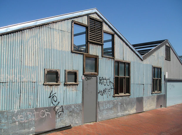
Composition/perspective � the spatial relationships in this scene are well done. Not too much sky or roadway; just enough building. Entering and leaving the scene at the sides instead of the bottom is a very nice aspect to the shot. The building itself acts to lead you across the scene. The angle to your subject is a nice perspective allowing you to see the building in one sense as a whole and then in another as just a shell. Well done! The shot is well focused and shows a lot of detail and texture in the many elements. The red brick against the smooth steel is a nice contrast. I think this image fell short in the processing area. Sharpening just a bit brings out a lot more detail in the brick pattern and really makes the window frames stand out. It also helps to define the waves and dents in the metal siding. Slight adjustment in levels (the image has a great histogram to work with) really helps to define the light and dark areas and sets up many more great contrasts in the image. This gives the image a lot more depth as well as feel.
Color � A boost in contrast really makes the red brick stand out and develops the blue shades more. This gives the image a very rich tonal range and palette. This also helps to define the textures present.
Lighting � well controlled natural light. There are no overbearing shadows and no distracting bright areas. The exposure was well executed.
Challenge requirements � this may be one area where it fell a bit short with the voters. Although this does appear to be some sort of old plant, there is not really anything that says industrial. The buildings themselves could be any sort of building. There are no fixtures that say industrial. There is no old equipment or stacks or what most would be looking for in an industrial setting.
Overall/my opinion � this image has a lot of potential and can be much stronger on its own with some post processing. It is a little weak for the challenge, but is still a good image that has a lot to offer the viewer.
|
|
 Photographer found comment helpful. Photographer found comment helpful. |
Comments Made During the Challenge  |
|
|
12/05/2005 08:37:17 PM |
| Good color and composition. |
|
| Photographer found comment helpful. |
|
|
12/02/2005 01:59:08 PM |
| good urban used industrial image, like the orange brick contrast. |
|
| Photographer found comment helpful. |
|
|
12/01/2005 03:23:43 AM |
| great structure, lines, and composition. |
|
| Photographer found comment helpful. |
Home -
Challenges -
Community -
League -
Photos -
Cameras -
Lenses -
Learn -
Help -
Terms of Use -
Privacy -
Top ^
DPChallenge, and website content and design, Copyright © 2001-2025 Challenging Technologies, LLC.
All digital photo copyrights belong to the photographers and may not be used without permission.
Current Server Time: 03/12/2025 08:11:59 PM EDT.