| Author | Thread |
|
|
12/08/2005 07:28:32 PM |
Howdy from the Critique Club!
You got lots of great comments on this, and I think you placed wonderfully in the challenge.
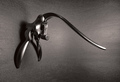
Composition
I liked the simple composition of this image. It focuses the viewer on your subject and message. I felt, however, that the camera was too close to the subject and I would have wanted to view this scene from a little further back. I would not have complicated the background or any with this, but might have chosen a lighter bg, or better light bg if there was too much black in the image from moving further away.
Colour and lighting
I think the lighting on your subject is well done, but i find myself looking for a little more light on the subject, especially near the right arm/right side would have been useful to even it out a bit. It is a bit dark and seems to trail off on that side. This also seems to affect the focus there which isn't as clear as the rest of the photo.
OVERALL, I think this was a very well done image. It would also work quite well in black and white as the colour isn't particularly vibrant or essential to the message of your image.
Congratulations on a well done image! :) |
|
 Photographer found comment helpful. Photographer found comment helpful. |
|
|
12/05/2005 07:18:06 PM |
| Yep this one was way under rated in my opinion. |
|
| Photographer found comment helpful. |
|
|
12/05/2005 05:44:37 PM |
| Wish this had done better. Very clean image. Well focused and lit perfectly. The skin tones look completely natural. WEll done! |
|
| Photographer found comment helpful. |
|
|
12/05/2005 02:27:54 PM |
| A nice image. Should have placed much higher. Keep batting away. |
|
| Photographer found comment helpful. |
|
|
12/05/2005 12:29:01 PM |
| This one is underrated IMO, crisp, funny and well composed. Should have scored higher. Well done. |
|
| Photographer found comment helpful. |
Comments Made During the Challenge  |
|
|
12/03/2005 12:21:28 AM |
| Ah, yes. Works very well for this challenge. Very cute. |
|
| Photographer found comment helpful. |
|
|
12/01/2005 08:56:44 PM |
| Hahahahaha....nice concept...lack of contast on her hair vs the background is problematic.....perhaps a shot from to POV of her looking in the mirror....hey you get a 7 for originality.... |
|
| Photographer found comment helpful. |
|
|
11/29/2005 09:06:05 PM |
| Hits the subject matter on the head. Nice lighting and background. |
|
| Photographer found comment helpful. |
|
|
11/28/2005 05:47:18 PM |
| cute idea! nicely composed and lit. |
|
| Photographer found comment helpful. |
|
|
11/28/2005 02:48:02 PM |
| good idea, but I would have cropped lower part a bid. 5 |
|
| Photographer found comment helpful. |
|
|
11/28/2005 10:29:32 AM |
| Nice crisp shot and perfect fit for this challenge. |
|
| Photographer found comment helpful. |
|
|
11/28/2005 03:12:44 AM |
| this is a great original idea 10 |
|
| Photographer found comment helpful. |
|
|
11/28/2005 01:41:26 AM |
| I was expecting more of this type of shot, but most of the entries focus around alcohol. Well composed. |
|
| Photographer found comment helpful. |
|
|
11/28/2005 12:35:53 AM |
| Really good. Great focus. I can't think of much of a complaint, except maybe crop out the numbers on the shirt. GOOD ONE!!! |
|
| Photographer found comment helpful. |
Home -
Challenges -
Community -
League -
Photos -
Cameras -
Lenses -
Learn -
Help -
Terms of Use -
Privacy -
Top ^
DPChallenge, and website content and design, Copyright © 2001-2025 Challenging Technologies, LLC.
All digital photo copyrights belong to the photographers and may not be used without permission.
Current Server Time: 04/28/2025 06:38:39 AM EDT.