| Author | Thread |
|
|
12/11/2005 12:07:17 PM |
Hello from the Critique Club!
I have studied your image and have the following to offer:
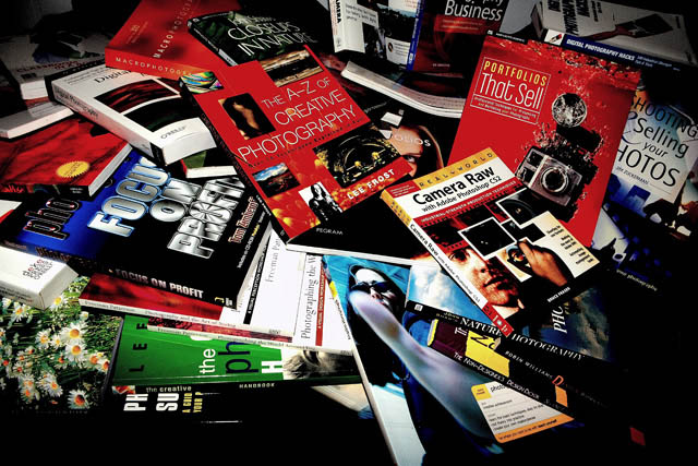
Composition/perspective � I am immediately hit with the crop on this image. I find the black areas at the bottom and on the lower right corner to be distracting. A slightly different crop and you may have been able to achieve an overall larger image � closer to 640x640 which would have put a lot more emphasis on the collection itself. At this distance to the shot it almost just looks like a pile of books as opposed to a collection of books. The focus is good, all the edges are clean and a lot of the text is clear, even the smaller text. Not sure why you used the exposure combination you did for this shot. I think it gives it sort of a removed look or a strange feel. Placement of the books may have been adjusted some to bring out more of the natural contrasts in the cover colors. Or even angle of approach of the camera to alter the center of focus. As it is it seems I am drawn to the two large areas of red while glancing over the rest. I also find the crop on the top a bit of a distraction, just looks too busy along the top for some reason.
Color � a lot of nice colors in the shot. May be a little over saturated � the appearance of some of the text against the colors is not as crisp as it could be. Red dominates the shot leaving the green to get lost which could have given a nice contrast. The darker covers could have been placed a little differently to help with some of the smaller areas of color.
Lighting � seems a bit dark overall while the white just below center appears very bright. A bit of a distraction and in conflict with the rest of the image. Good control over reflection off the glossy covers though. Some of the shadows are a bit dark, but these areas (above) could be cropped out.
Challenge requirements � meets the challenge requirements as far as a collection goes. All the books appear on topic so there is no dispute there. May have lost some with the voters in this area though. Some may have seen it as not very creative. Tough call.
Overall/my opinion � not sure what it is with the image, but just does not seem to have that element that makes it stand out. The lighting seems to set an awkward mood for the scene that just appears in conflict with the subject matter.
|
|
 Photographer found comment helpful. Photographer found comment helpful. |
|
|
12/09/2005 04:26:45 PM |
Hmmm, technically I think this is well done. The lighting is nice and the focus is sharp. Colors are bright and vibrant. I think perhaps there is not a lot of intent in the picture. It looks like a jumble of books (which it should), but there isn't any sort of pattern or design for the eye to catch. I'm not saying they need to be aligned or anything, but maybe taking some of the colors on the book and arranging them so we get some contrasts, etc. (Maybe the green book would have looked good between the two red ones.)
You have a very even distribution in votes and that makes me think that nobody really found much wrong with it, but they didn't see anything to fall in love with either. |
|
| Photographer found comment helpful. |
Comments Made During the Challenge  |
|
|
12/06/2005 06:39:42 PM |
made me smile! i'm working on my own collection of those...
energetic composition, like the woman/hand and daisies covers as they add some unexpected energy and interest. cool shot! |
|
| Photographer found comment helpful. |
|
|
12/02/2005 03:28:12 AM |
lame! sorry but it doesnt show much effort did you just take a picture of the first thing you saw or what?
Imagination is more important than knowledge. -- Albert Einstein
have you ever heard that quote? |
|
| Photographer found comment helpful. |
|
|
12/01/2005 01:38:19 PM |
| How about adding an actual camera to the picture? |
|
| Photographer found comment helpful. |
|
|
12/01/2005 12:26:20 AM |
| clean crisp dramatic shot |
|
| Photographer found comment helpful. |
|
|
11/30/2005 04:28:19 PM |
| nice shot, and great subject. hope you do well! |
|
| Photographer found comment helpful. |
|
|
11/30/2005 03:50:03 PM |
| maybe more of a crop along the bottom, would be nice. I like the idea! |
|
| Photographer found comment helpful. |
|
|
11/30/2005 01:45:24 AM |
| I don't see "How to take pictures of your book collection" ;-) |
|
| Photographer found comment helpful. |
Home -
Challenges -
Community -
League -
Photos -
Cameras -
Lenses -
Learn -
Help -
Terms of Use -
Privacy -
Top ^
DPChallenge, and website content and design, Copyright © 2001-2025 Challenging Technologies, LLC.
All digital photo copyrights belong to the photographers and may not be used without permission.
Current Server Time: 03/12/2025 02:03:23 AM EDT.