| Author | Thread |
|
|
12/11/2005 01:58:11 AM |
::: Critique Club :::
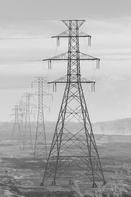
Hi Steve and welcome to the DPC Challenge. Congratulations on a good start by scoring 58% in your first try.!
Thanks for putting in your photographer's comments, they help enormously in doing a critique. The Photograph information really helps a critique too. You can get it from your images by right-clicking it in Win Explorer -> Properties -> summary -> Advanced. That will give you the Aperture, ISO and shutter details plus a whole lot more. Be aware that if you edit in any way the file that comes out of your camera and save it to the same name, all that (EXIF) data will be lost. Always do a Save As for the first step.
First Impression - the most important one:
I'm a sucker for snow and winter, it's where my soul is, so my first impression is always a warm one:) Photographically, this really gets a comfortable reaction from the eye and as you see, has attracted votes accordingly.
Composition:
The composition in this image is that of a trained photographer or a very good photographer's natural eye. Whether by accident or design, you have used perfectly the two main basic rules of composition in this image.
The Rule of Thirds: the foremost pylon is on a vertical thirds line. It is comfortable to the eye there and strikes a chord with the viewer. Rule of Leading Lines: you've got the pylons leading the eye into the picture as they have the perspective lines to follow. Believe it or not, this gives the image 3D depth rather than a flat feel. Research proves these 'rules' to be effective pleasing elements to viewers of paintings or photographs.
There is a third 'rule'. Research again tells us that the eye naturally enters an image bottom left and goes out top right, failing that, at least left to right. That could apply in two ways to this image. You could say it already does that by the eye following the line from the small pylon to the large. Or, you could consider the large pylon as the starting point from which the eye travels along the perspective to the smaller one. To test the latter case, I would try a mirror of the image and see which works better.
Remember though that rules are for the Adherence of Fools and the Guidance of Wise Men.
Subject:
This is a simple mood and geometric image that meets the challenge well. Less is often more and this image has that. It's not overstated but a simple study of the one thing that no industry can do without - energy. I also applaud your lateral view of the obvious response to this challenge ... factories and smoke with water/clouds/reflections etc. It is "different" that has the most chance of cutting through all of the rest.
Technical (Colour and light):
This is the weakest aspect of the image. That it scored so well, yes it did, with this flat grey slightly overexposed look is a testament to how well you got those other elements so right.
In a way, the misty look is appealing. It gives the image mood and isolation, both are useful emotively on voters. You could preserve that feel whilst making the contrast a little more pronounced and giving the image some oomph. If you have editing software that does adjustment layers, you can make non-destructive (original pixels untouched) adjustments to things like brightness and contrast. If not, most graphics programs will let you adjust brightness, contrast or gamma.
Take this image and try some differing settings, they can transform your ex-camera original in ways you couldn't imagine. Don't push it though, they're a savvy lot here and they can tell when you're desperate and trying too hard :)
Summary:
This is a damned fine start, you have the eye. See you again we hope :)
Brett |
|
 Photographer found comment helpful. Photographer found comment helpful. |
Comments Made During the Challenge  |
|
|
12/06/2005 07:59:20 PM |
| this is really nice, i liked the depth of it.. |
|
| Photographer found comment helpful. |
|
|
12/06/2005 07:44:17 PM |
| Attack of the giant pylons - very interesting tonal quality. |
|
| Photographer found comment helpful. |
|
|
12/02/2005 01:57:41 PM |
| nice gray industrial feel, good composition. |
|
| Photographer found comment helpful. |
|
|
12/02/2005 12:07:16 PM |
|
| Photographer found comment helpful. |
|
|
12/01/2005 01:58:23 AM |
| power to the masses, nice soft tone shot of power lines |
|
| Photographer found comment helpful. |
|
|
11/30/2005 05:44:58 PM |
| Beef up the contrast and you've got a great shot! |
|
| Photographer found comment helpful. |
|
|
11/30/2005 04:09:08 PM |
| beautifully composed and great industrial feel to it!! |
|
| Photographer found comment helpful. |
|
|
11/30/2005 12:37:21 PM |
| I'm sad that you found the pic I wanted to take. I love this. GREAT job. And B&W made it even better. It wouldn't have the same effect in color. |
|
| Photographer found comment helpful. |
|
|
11/30/2005 12:37:20 PM |
| interesting personification - like aliens, I think the soft contrasts works nicely |
|
| Photographer found comment helpful. |
|
|
11/30/2005 11:47:30 AM |
| good perspective and DOF. The haze truly adds to this |
|
| Photographer found comment helpful. |
Home -
Challenges -
Community -
League -
Photos -
Cameras -
Lenses -
Learn -
Help -
Terms of Use -
Privacy -
Top ^
DPChallenge, and website content and design, Copyright © 2001-2025 Challenging Technologies, LLC.
All digital photo copyrights belong to the photographers and may not be used without permission.
Current Server Time: 03/11/2025 02:13:23 PM EDT.