| Author | Thread |
Comments Made During the Challenge  |
|
|
12/06/2005 02:38:34 PM |
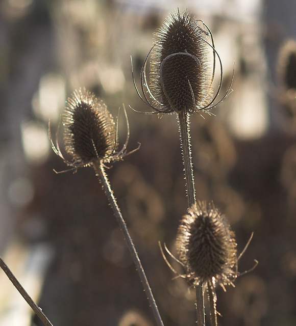
| Interesting DOF, I like how you blurred a foreground element. The colours are poor though, a B&W version would have looked much better. 6. |
|
 Photographer found comment helpful. Photographer found comment helpful. |
|
|
12/05/2005 08:55:16 AM |
|
| Photographer found comment helpful. |
|
|
12/04/2005 04:21:47 PM |
| A little more contrast may have worked better. It looks almost too lightened. You loose the sharpness of the thistles and to me it looks like there is a film over the pic. |
|
| Photographer found comment helpful. |
|
|
12/04/2005 11:09:44 AM |
| Oh, this would be lovely framed and hanging on the wall! My favorite part of this shot is the backlighting. Nice job! |
|
| Photographer found comment helpful. |
|
|
12/04/2005 10:08:49 AM |
|
|
|
12/01/2005 09:26:48 PM |
6 - Nice. Criticism; a bit sharper if possible, especially to show the texture more. Perhaps a rotation and more selective crop (mainly to eliminate that stem on the left and the seedhead back right (losing it or incorporating it)) may have helped to make this even better in my opinion. The bokeh is nice, like to see the color just notched up a fraction if possible, but probably contrast issues in doing so, so who knows. Maybe even a 640 x 640, with more space to the left and above, but then there is that stem, and also depends what you had to work with. edit:typo
Message edited by author 2005-12-08 16:34:34. |
|
| Photographer found comment helpful. |
|
|
12/01/2005 09:47:07 AM |
|
| Photographer found comment helpful. |
Home -
Challenges -
Community -
League -
Photos -
Cameras -
Lenses -
Learn -
Help -
Terms of Use -
Privacy -
Top ^
DPChallenge, and website content and design, Copyright © 2001-2025 Challenging Technologies, LLC.
All digital photo copyrights belong to the photographers and may not be used without permission.
Current Server Time: 03/17/2025 02:36:09 AM EDT.