| Author | Thread |
|
|
12/11/2005 09:03:58 AM |
Hello from the Critique Club!
I have studied your image and have the following to offer:
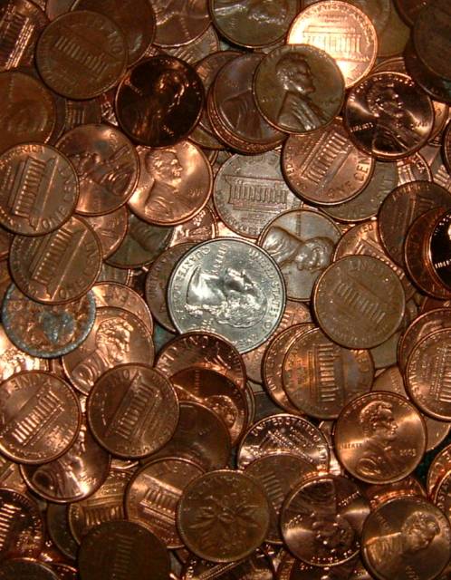
Composition/perspective � the composition is set up very centered.. The quarter is dead center in the image. A different crop to place this off center may have helped � more in line with the rule of thirds. Although this is a collection (see below) it is a theme that has been seen many times and with this one, even with the title and the apparent challenge to find the flaws, doesn�t have too much to make it really stand out and grab you. At first the overall focus seems off. Although the edges of the coins seem crisp, the detail of the coins is not. With a hard subject such as metal coins, the image would gain more strength if it was crisp. This tells me some sharpening is all it needs to make all the detail pop right out. There is one penny near the top that is much brighter than the rest. This draws attention to it immediately � even over the quarter. This is in contrast to the rest of the pennies that in general seem a little dark. With some levels adjustment the tonal range in the whole image can be developed more giving more balance to the light and dark areas. A boost in contrast would help to bring out the variations in the pennies colors and add a lot more interest to the photo by bringing out a lot of the rich tones across the image.
Color � the color here seems a little flat. The pennies have a lot of natural color variation and with the added patina of use, there is a wide range of excellent tones and shades that are not as developed as they could be. Using levels and contrast can reverse this nicely.
Lighting � not sure what the light source is here. Appears to be a single source or a flash. The quarter and the one penny seem to be the beneficiary of the light. The rest of the image seems a little dark. This may be due to the pennies not being flat and just did not pick up the light due to the angle they are laying on. A more directed light at an opposing angle to the camera to control reflections may have worked better.
Challenge requirements � although a little weak in my opinion, it is a collection, it is a very common subject � coins. There is just not enough �wow� to the shot to make it stand out and this may have hurt in the voters eyes.
Overall/my opinion � this could be a much stronger image with a little post processing or slightly different post processing. Piles of coins/arrangement of coins is a common subject (seen in many challenges) and for one shot to stand out it needs some element that is unique or have just the right combination of factors that the viewer is immediately grabbed by the image. With the post processing mentioned in this critique (I downloaded the image and applied) the image turns into a whole new scene with lots of detail, lots of great color variations across the scene and a lot more appeal. The potential is definitely there.
|
|
 Photographer found comment helpful. Photographer found comment helpful. |
Comments Made During the Challenge  |
|
|
12/06/2005 09:22:39 PM |
| like the quarter in with all the pennies. i think a scrim would help diffuse the lighting and give the coins a more even glow. |
|
| Photographer found comment helpful. |
|
|
12/04/2005 08:23:27 AM |
| That looks like my savings account, nothing but pennies. Nice idea for this challenge. Hope that you do well.... |
|
| Photographer found comment helpful. |
|
|
12/02/2005 07:14:27 PM |
| Looks like the top of my dresser. Very nice image. I enjoy the randomness in it. I wonder if moving the quarter off center to one of the rule of third spots would have given it more punch. |
|
| Photographer found comment helpful. |
|
|
12/01/2005 12:59:44 AM |
|
| Photographer found comment helpful. |
|
|
11/30/2005 11:47:25 PM |
| I found it! The first one was easy, but the second one took some work. Your picture was entertaining and kept my attention so I suppose thats worth something. |
|
| Photographer found comment helpful. |
|
|
11/30/2005 11:30:12 PM |
| a strong composition and one that suits the challenge |
|
| Photographer found comment helpful. |
|
|
11/30/2005 12:15:10 PM |
| This collection looks like my desk drawer...hey.... |
|
| Photographer found comment helpful. |
|
|
11/30/2005 01:31:10 AM |
| I like the photo but feel that there is just so much going on in it. |
|
| Photographer found comment helpful. |
Home -
Challenges -
Community -
League -
Photos -
Cameras -
Lenses -
Learn -
Help -
Terms of Use -
Privacy -
Top ^
DPChallenge, and website content and design, Copyright © 2001-2025 Challenging Technologies, LLC.
All digital photo copyrights belong to the photographers and may not be used without permission.
Current Server Time: 03/12/2025 03:06:35 PM EDT.