| Author | Thread |
|
|
04/21/2006 08:00:10 AM |
| should have placed much much higher. Great photo |
|
 Photographer found comment helpful. Photographer found comment helpful. |
|
|
03/21/2006 01:32:45 AM |
| This is a great shot and very original in my opinion...love the DoF and the light |
|
| Photographer found comment helpful. |
|
|
12/23/2005 08:38:07 PM |
| Great focus & DOF! I really like the wide crop too, although I agree somewhat with one of the other commenters about a little more room at the top and less at the bottom (but that's a personal preference). It's a great shot and very well executed. Nice job. |
|
| Photographer found comment helpful. |
Comments Made During the Challenge  |
|
|
12/06/2005 11:58:44 PM |
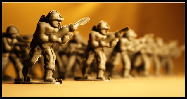
7 - Good. Criticism; your call obviously, but in my opinion, a tighter crop at the bottom, perhaps with even more space at the top, would have made this even better. Like the depth of field and background, although do wonder whether a different color choice of background would have enhanced the soldiers. Not sure on the thick frame. Also seems a 'flaw' on the right near the bottom in the foreground. Up to 7 from 6. edit:6 to 7 at beginning of comment
Message edited by author 2005-12-07 00:31:54. |
|
| Photographer found comment helpful. |
|
|
12/06/2005 09:17:06 PM |
| i like this image very much. great dof, interesting subject. like the background color, too. |
|
| Photographer found comment helpful. |
|
|
12/05/2005 07:01:09 PM |
| cool use of subject, light and space |
|
| Photographer found comment helpful. |
|
|
12/05/2005 03:02:59 AM |
| Love he colouring, pity that when you get so macro you loose the DOF that you need |
|
| Photographer found comment helpful. |
|
|
12/04/2005 10:27:12 AM |
| This could be a better shot if you used a smaller aperture to increase the depth of fous, and had more contrast with the background. |
|
| Photographer found comment helpful. |
|
|
12/04/2005 06:32:03 AM |
| Great idea for this challenge. I would have likes to see a little more DOF here. Great choice for the background color, adds to the shot. |
|
| Photographer found comment helpful. |
|
|
12/01/2005 11:11:53 PM |
| nece execution and lens choice. I think a darker or more textrued surface would have made this look more dramatic and not pulled your eyes down so much |
|
| Photographer found comment helpful. |
|
|
12/01/2005 07:12:15 PM |
| Great POV, great depth of field! |
|
| Photographer found comment helpful. |
|
|
12/01/2005 02:28:21 PM |
| nice shot! good job,hope you do well! |
|
| Photographer found comment helpful. |
|
|
12/01/2005 02:15:09 AM |
| I like it...could be a little clearer! |
|
| Photographer found comment helpful. |
|
|
12/01/2005 01:32:55 AM |
| Something about the imperfect mould that makes this appear over sharpened. |
|
| Photographer found comment helpful. |
|
|
11/30/2005 10:50:57 PM |
| I like the softness and fade out quality. Strong message and lovely gold tones |
|
| Photographer found comment helpful. |
|
|
11/30/2005 10:46:27 PM |
| Great fun, great pic. Good lighting and focus. |
|
| Photographer found comment helpful. |
|
|
11/30/2005 08:33:37 PM |
|
| Photographer found comment helpful. |
|
|
11/30/2005 02:49:12 PM |
| Nice setup and lighting on this photo. While I really like your composition, it does leave me wondering how a slightly higher POV might look. Keep up the good work! |
|
| Photographer found comment helpful. |
|
|
11/30/2005 12:49:11 PM |
| Really nice...the bad plastic cut is part of the charm and brings back memories- 10 |
|
| Photographer found comment helpful. |
|
|
11/30/2005 01:00:13 AM |
| Ordinary collection taken to extraordinary heights with the help of great composition and the perfect color palate. |
|
| Photographer found comment helpful. |
Home -
Challenges -
Community -
League -
Photos -
Cameras -
Lenses -
Learn -
Help -
Terms of Use -
Privacy -
Top ^
DPChallenge, and website content and design, Copyright © 2001-2025 Challenging Technologies, LLC.
All digital photo copyrights belong to the photographers and may not be used without permission.
Current Server Time: 03/13/2025 03:51:48 AM EDT.