| Author | Thread |
Comments Made During the Challenge  |
|
|
12/06/2005 08:20:16 PM |
|
|
|
12/04/2005 02:39:17 PM |
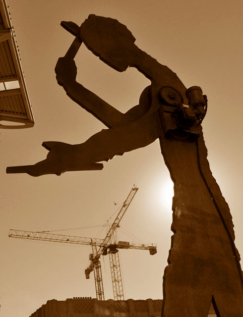
| Had the object in the upper left corner not been there, I would have scored this 1-2 points higher. |
|
|
|
12/02/2005 11:22:17 AM |
Nice framing, too bad about the overhang top left.
Very interesting though and like the crane in the 'frame' of the sculpture's arm/body. |
|
|
|
12/01/2005 02:57:01 PM |
|
|
|
12/01/2005 02:05:06 AM |
| I scored it an 8, but it's a 10 without the roof bit or whatever that is. I for one would not object to a little photoshop to save this almost perfect picture. |
|
|
|
12/01/2005 01:03:40 AM |
| clever shot, well done. love the monotine effect |
|
|
|
11/30/2005 08:50:22 PM |
|
|
|
11/30/2005 08:35:13 PM |
great, too bad you couldnt lose stuff on top left
|
|
|
|
11/30/2005 02:55:43 PM |
| I think you tried to put too much into this picture. It took me a minute to recognize the sculpture. For me, the cranes took away from your image, not add impact. I think this would have worked better if you focused on just the sculpture. |
|
|
|
11/30/2005 02:40:22 PM |
| wow...interesting picture! i love the angle of how youve taken this picture...nicely done |
|
|
|
11/30/2005 12:59:53 PM |
| For me this just misses. The backlighting seems annoying. Might be better if higher in the sky (like behind the head). The roof (?) in the upper left is distracting. |
|
|
|
11/30/2005 12:52:50 PM |
| the bit of the roof sticking out detracts. otherwise excellent effort! 7 |
|
|
|
11/30/2005 02:39:25 AM |
| Looks like an existing art work is photographed |
|
|
|
11/30/2005 01:10:40 AM |
| Love the subject and dusty feel. I wish the part of the roof wasn't visible at the top left. |
|
Home -
Challenges -
Community -
League -
Photos -
Cameras -
Lenses -
Learn -
Help -
Terms of Use -
Privacy -
Top ^
DPChallenge, and website content and design, Copyright © 2001-2025 Challenging Technologies, LLC.
All digital photo copyrights belong to the photographers and may not be used without permission.
Current Server Time: 04/26/2025 07:14:32 PM EDT.