| Author | Thread |
|
|
12/09/2005 09:57:56 PM |
::: Critique Club :::
Great fun to do a critique on your image but it is dificult if you don't give us any information in your photographers comments. When we do a critique, we go past just the photographic result, that's what voters comments do. The critique looks at what you were trying to achieve, how you wanted it to look and what issues you had in getting the image captured and ready for voting.
First Impression - the most important one:
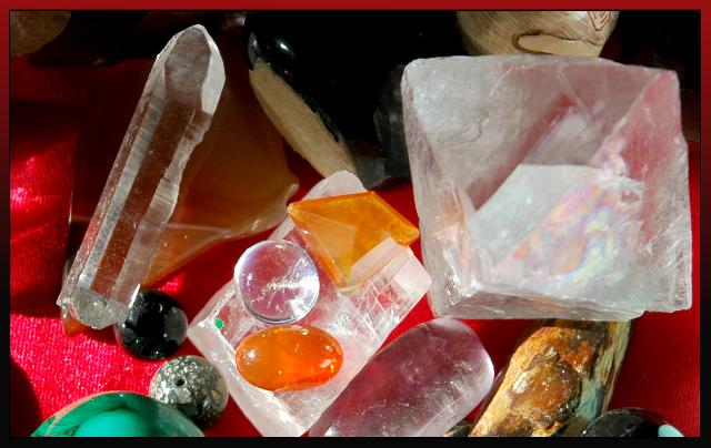
A blast of colour, light and shapes. I wasn't quite sure what I was looking at, but studying it got me there.
Composition:
Composition is about leading the eye into an image (painting or photo), research shows that the eye enters bottom left and travels up to top right. Once in there, the same research tells us that the eye finds comfort in the point of interest (POI) that sits on a thirds line or intersection.
Your rocks are a little haphazard and so they confuse the eye. It doesn't know where to begin and can't find the main POI to settle on. Since we're basically lazy creatures we then don't make any further effort to decipher what we're seeing. This means the viewer disconnects from the image instead of engaging with it.
Subject:
The rocks have the most amazing structures, textures and form. They are a perfect subject to photograph as they are translucent and allow light into them and through them to explore their beuty and flaws.
Technical (Colour and light):
Light through stones, especially through the side or back just ignites their textures and mystical qualities. The truism of this is that we almost always hold them up to the light to look at them. By contrast the light in the image is more front-on which has flattened those beautiful structures and that's a shame.
With colour, the stones themselves have so much to offer. The red carpet has really sucked up all the light and colour and taken it away from the rocks - which is a pity. Look how diamonds are displayed on black velvet to bring out their colour and depth. Your collection would benefit from that too. It would make them glow and sparkle, the colour would radiate.
Summary:
The collection is lovely and the possibilities only need a little tweaking technically to really show them off to their best.
If you'd like to chat further via PM on any of the technicalities, please do.
Brett |
|
 Photographer found comment helpful. Photographer found comment helpful. |
Comments Made During the Challenge  |
|
|
12/06/2005 09:08:51 PM |
| i wonder how this could have been arranged to lend greater visual interest? |
|
| Photographer found comment helpful. |
|
|
12/06/2005 09:58:00 AM |
| Great focus and composition. Not sure about the border since you kind of lose it in the bottom left corner. Hope to see you in the top ten. |
|
| Photographer found comment helpful. |
|
|
12/04/2005 04:27:37 AM |
|
| Photographer found comment helpful. |
|
|
12/03/2005 12:31:20 AM |
|
| Photographer found comment helpful. |
|
|
12/01/2005 02:30:21 AM |
|
| Photographer found comment helpful. |
|
|
11/30/2005 11:03:24 PM |
| not to bad, but would have liked a more balanced composition |
|
| Photographer found comment helpful. |
|
|
11/30/2005 05:59:09 PM |
| hey, one of those looks like coprolite! |
|
| Photographer found comment helpful. |
|
|
11/30/2005 02:50:41 PM |
|
| Photographer found comment helpful. |
|
|
11/30/2005 01:57:16 AM |
| Good title, nice photo, fine collecition |
|
| Photographer found comment helpful. |
Home -
Challenges -
Community -
League -
Photos -
Cameras -
Lenses -
Learn -
Help -
Terms of Use -
Privacy -
Top ^
DPChallenge, and website content and design, Copyright © 2001-2025 Challenging Technologies, LLC.
All digital photo copyrights belong to the photographers and may not be used without permission.
Current Server Time: 03/14/2025 04:04:10 AM EDT.