| Author | Thread |
|
|
11/28/2007 06:18:29 PM |
| weak, should have done better! I like it, so thats good. :P |
|
 Photographer found comment helpful. Photographer found comment helpful. |
|
|
01/22/2007 02:05:44 AM |
oh...my....god....
I have that shirt!
freaky....
:D |
|
| Photographer found comment helpful. |
|
|
07/31/2006 10:38:45 PM |
| This is tooooo cool! You got ripped!! Should have scored at least a 14. (well, highter than what you got anyway!) |
|
| Photographer found comment helpful. |
|
|
12/07/2005 07:04:21 PM |
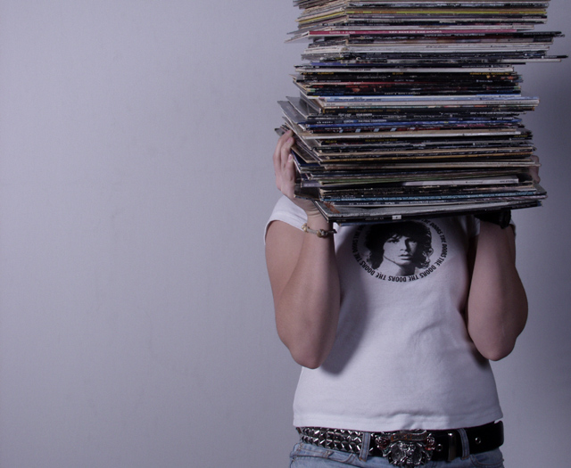
great concept, love the shirt. the brightness should be higher with a bit more contrast... looks a bit underexposed. but you're on the right track.
|
|
| Photographer found comment helpful. |
Comments Made During the Challenge  |
|
|
12/06/2005 09:17:12 PM |
| nicely composed, like the use of negative space. the lighting gives it a "screen door "feeling, though, and i find myself wishing that the shot were crisper/brighter. like the jim morrison shirt! a cool composition and great idea for this challenge! |
|
| Photographer found comment helpful. |
|
|
12/06/2005 08:10:39 PM |
| Excellent shot I love your placement and overall choice. |
|
| Photographer found comment helpful. |
|
|
12/06/2005 12:49:25 PM |
| Musceles don't seem to be bulging yet.............LOL |
|
| Photographer found comment helpful. |
|
|
12/04/2005 10:36:59 AM |
| Great shot. Some fill light to reduct the arm shadow would make it even better. |
|
| Photographer found comment helpful. |
|
|
12/01/2005 11:31:50 PM |
| Kinda cool, kinda retro. I guess I like it. |
|
| Photographer found comment helpful. |
|
|
12/01/2005 10:09:40 AM |
|
| Photographer found comment helpful. |
|
|
12/01/2005 07:13:27 AM |
| Colours seem pale, but the composition is nice. |
|
| Photographer found comment helpful. |
|
|
12/01/2005 12:56:47 AM |
| I think the fact that cut of the model's head off is interesting and somewhat different. I like. |
|
| Photographer found comment helpful. |
|
|
12/01/2005 12:12:56 AM |
| Uhhhh Doors! You're just as bad as that Pink Floyd one I saw! Why can't anyone ever listen to less boring classic rock. That aside Im only going to dock you a few points because your photo is technically not bad, but dont think you got away from my unjust bias! |
|
|
|
11/30/2005 11:16:02 PM |
| Nice idea, but it's too dull and dark. A little contast and brightness would have helped. |
|
| Photographer found comment helpful. |
|
|
11/30/2005 08:10:33 PM |
|
| Photographer found comment helpful. |
|
|
11/30/2005 06:59:53 PM |
|
| Photographer found comment helpful. |
|
|
11/30/2005 05:12:15 PM |
| I like it. It looks like an album cover. I think it could use more contrast and less gray, but overall it's good - 6 |
|
| Photographer found comment helpful. |
|
|
11/30/2005 04:39:31 PM |
| self portarait?? nice idea. |
|
|
|
11/30/2005 03:09:41 PM |
| Nice shot, a bit too cool and a bit desautrated. |
|
| Photographer found comment helpful. |
|
|
11/30/2005 02:35:40 PM |
| would be better with a little more contrast... |
|
| Photographer found comment helpful. |
|
|
11/30/2005 02:28:33 PM |
|
| Photographer found comment helpful. |
|
|
11/30/2005 01:32:59 PM |
| Great composition! I love the creativity of how you have displayed your collection. It's an interesting, appealing photo! |
|
| Photographer found comment helpful. |
|
|
11/30/2005 07:23:12 AM |
| Better background would make a difference...7 |
|
| Photographer found comment helpful. |
|
|
11/30/2005 07:01:50 AM |
|
| Photographer found comment helpful. |
|
|
11/30/2005 01:41:26 AM |
| A little dark and needs some contrast adj I think, but good comp and nicely done. Good luck - hope you break on through to the other side ;-) |
|
| Photographer found comment helpful. |
|
|
11/30/2005 12:32:50 AM |
| Oh I love this. Between Jim Morrison on the shirt and the nostalgia of records. Nice use of negative space. THe overall tone even has a 60's sense to it - kinda blue! 8 |
|
| Photographer found comment helpful. |
Home -
Challenges -
Community -
League -
Photos -
Cameras -
Lenses -
Learn -
Help -
Terms of Use -
Privacy -
Top ^
DPChallenge, and website content and design, Copyright © 2001-2025 Challenging Technologies, LLC.
All digital photo copyrights belong to the photographers and may not be used without permission.
Current Server Time: 03/12/2025 02:52:56 PM EDT.