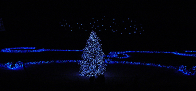
| Gave this a 3. The color was nice and the composition fairly well balanced. Criticism; depending what you had to work with, a slight variation in the crop to give more balance and symmetry may have made this better in my opinion. No expert on photography, especially long exposures (nor do I know what camera settings you have etc), but looking briefly at your settings, and from what I am learning on, eg; ISO, perhaps if you used a lower ISO that may have helped reduce the grain, not sure (I would suggest if you were interested in improving your night shots to research what your camera can do and how you can best use the features to try to achieve your desired shot). Depending also the 'access' to this scene, I think that a slightly sharper (ground level) perspective/angle may have worked better, or else just 'further to the left' to allow the tree to become more centered. If the size were 640 width would have been better (especially for 'here', try to 'show' your shot at the highest dimensions (640 width or height or both)), but again, if the quality was like this would only have 'enhanced' that grain that I can see remnants of here at this size. There are also two 'unusual dark shapes' under the tree, which slightly detracted, but minor. This Challenge was advanced editing, so perhaps you could have 'softened' the grain/dark areas, or just generally tried to 'manipulate' various parts of the image using the tools available to you (in whatever pp program you use), to try to achieve the type of shot you envisioned. Finally, this being a 'Holiday Catalog' Challenge, my interpretation (and many interpret Challenges differently) was that the shot would be something you would see in a Holiday (Christmas) Catalog. The only 'quick connection' (that is all most voters attempt - a 'quick connection'/look) that I could make was 'tree lights' being 'advertised' - and that was a bit of a stretch. Hopefully this comment helps you - I would have commented on a portfolio entry, but you have none (yet). |