| Author | Thread |
|
|
07/01/2002 08:31:00 AM |
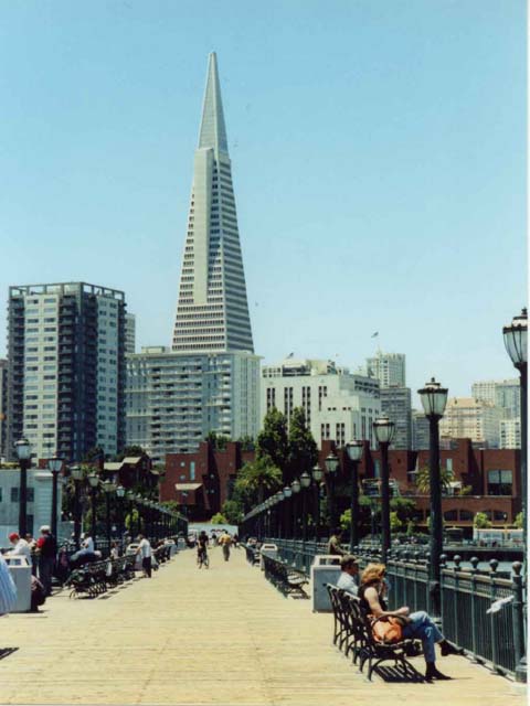
| Thanks for all the comments! Sorry about the poor quality that many have noted but being the first submission, I was trying to learn how all this works. It was much easier taking the photograph than getting Photoshop Elements and uploading it to this Web site! It took me forever to figure out how to get the right size, width, height, etc. I actually did crop the photo but I also see that I played with it too much (the extra border). Also I was pushed for time on Sunday night, I didn't take the care to make sure key elements were focused. I took the photo near Fisherman's Warf, but it's not Pier 39, a few piers before (sorry, I didn't pay attention to the number. I was all the way at the end of the pier when I did see how nicely lined up the posts were to the buildings, particularly the trianglar one. I was also wishing the Pier to be such a bit longer. Maybe I'll try again in a boat. Interestingly enough, there was another photographer there too but I was jealous of him because he had better equipment! Just to ease another question that alarmed me!, NO it's not an old postcard I scanned! I really did take this photograph! |
|
Comments Made During the Challenge  |
|
|
06/30/2002 11:52:00 PM |
| Great, but it looks like a scanned image |
|
|
|
06/30/2002 10:20:00 PM |
| The photo lacks a lot of detail that could the shot out. |
|
|
|
06/30/2002 04:56:00 PM |
| only 45Kb - you are allowed 150Kb which you need to use to challenge the 'big boys' - voters are looking for quality - some before content! |
|
|
|
06/29/2002 08:46:00 PM |
| Excellent use of leading lines! |
|
|
|
06/29/2002 05:23:00 PM |
| I'd crop this image somehow to take away some of the boardwalk from the foreground. |
|
|
|
06/28/2002 09:50:00 PM |
| Looks like an old postcard. Nice angle. |
|
|
|
06/28/2002 03:40:00 PM |
| Maybe it's just the digital nature of longer shots, but it doesn't seem that clear. I like the idea/framing, etc. The lamp posts make in interesting effect, but on the whole......Photo 8 City 9 total 8 |
|
|
|
06/28/2002 02:27:00 PM |
| strange looking photo.. looks like it was scanned from an older photo |
|
|
|
06/28/2002 12:10:00 AM |
|
|
|
06/27/2002 10:12:00 AM |
| This would have been awesome if it was clear. Levels, sharpened or something too much? |
|
|
|
06/27/2002 01:04:00 AM |
| This is so washed out, it looks like a bad scan. You also have a border on the right, which is against site rules. |
|
|
|
06/26/2002 07:49:00 PM |
| has a strange washed out quality, and a weird bluish color cast. could be a little sharper. nice shot. |
|
|
|
06/26/2002 01:37:00 PM |
| interesting shot, as far as city scenics go, this is very good. |
|
|
|
06/26/2002 01:17:00 PM |
| Real nice. I love this city and I peed on that building once. |
|
|
|
06/26/2002 10:45:00 AM |
| Not very sharp. It looks old. |
|
|
|
06/26/2002 12:02:00 AM |
| Nice composition and colour. |
|
|
|
06/25/2002 03:19:00 PM |
| Nice picture, but the resolution looks very bad... |
|
|
|
06/25/2002 09:36:00 AM |
| I love the composition of this photo. It looks really blurry to me though and I would have cropped the person/bag/whatever out of the lower left side. This would be a winner without the blur...as is 7. Good job! |
|
|
|
06/24/2002 11:36:00 PM |
| Nice composition. I like the way the eye is led around the picture. You have two basic light levels in this picture however which would have been hard to manage within the rules of this challange. You couldn't have lightened the background buildings much without blowing them out, but the darker colors of the brick building, trees, and lamp posts merge and the effect is to lessen the impact. You might have been able to open up the exposure a stop though, which might have pulled the line of lamp posts visually out from the trees. |
|
|
|
06/24/2002 10:26:00 PM |
| very nice city life view... I bet this one would look nice at night too :) = 6 - jmsetzler |
|
|
|
06/24/2002 09:35:00 PM |
| Looks like a post card, nice! |
|
|
|
06/24/2002 08:17:00 PM |
| nice perspective......how did you process this to get that "old" look? |
|
|
|
06/24/2002 05:58:00 PM |
| I like the composition - the rows of lights leading up to the pointed building. Well done! The only con I see is that maybe the texture of the walkway could be a little more defined. Where in San Francisco is this? Beautiful place. |
|
|
|
06/24/2002 05:42:00 PM |
| nice photo but I wish it was a bit more focused along the pier |
|
|
|
06/24/2002 05:04:00 PM |
| Wow. Looks like a scan.....? Wonderful shot, DOF is great. Good work. Kee |
|
|
|
06/24/2002 02:10:00 PM |
| I think if the existing colors were a little brighter, this picture might have a little more *pop* I like the way the lightposts pull your eyes toward the center of the picture, and then the tallest building pulls your eyes up. |
|
|
|
06/24/2002 01:12:00 PM |
| Oops; a pixel off on the right? Nice perspective with the chairs and lamps. But you knew that. I might have brigtened it a bit. |
|
|
|
06/24/2002 12:02:00 PM |
| nice... but it seems a bit out of focus, no? |
|
|
|
06/24/2002 11:50:00 AM |
| this looks like a scanned picture |
|
|
|
06/24/2002 10:00:00 AM |
| Very nice strong lines! a little fuzzy (Mono/tripod might have helped) The only other thing I would change is maybe waiting for a more interesting (ie. colorful) subject to wander into the center. The eye is drawn to the bike, but s/he is fuzzy far and dark. |
|
|
|
06/24/2002 04:32:00 AM |
|
|
|
06/24/2002 01:09:00 AM |
| very interesting how you have the whole perspective thing going on with the lamps, then you have the people, and the buildings too. |
|