| Author | Thread |
|
|
01/04/2006 05:16:16 PM |
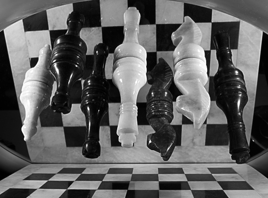
I think the biggest reason your score was lower was the clutter. The pieces, although this is a cool effect, detract from the "pattern" of the board. If you look at the winners you will see simple patterns that are interesting and prominent. I lowered brightness by -10 and bumped contrast by +10 in PS and I think it gives it a little extra kick.
Composition and cropping are just fine. |
|
 Photographer found comment helpful. Photographer found comment helpful. |
|
|
01/04/2006 02:07:24 PM |
*Critique Club*
Well, it looks like you received some very nice, very helpful comments after the challenge already. I didn't see the thread asking for opinions, so I don't know what other opinions you may have gotten there, so I'm not really sure what to add to that other than my personal opinions.
Per your request, here's your Critique Club comment...
The image seems to me to be lacking contrast. It's quite grey. I'd like to see some brighter whites. You could play with the contrast and brightness a bit, this usually gets me to where I want. I tried it with this image briefly and it seemed to take away some of the detail in the black pieces. So maybe curves adjustments would work better?
The image to me seems a bit small. Try to take advantage of the full 640 pixel limit on photos. This will help us to better see what we're looking at and give us more of a sense of details.
Focus does seem a bit soft. I have photographed chess pieces and ran into the same problem. I got VERY few photos that actually came out looking generally focussed. Not sure how to clarify 'fixing' that problem, except to take lots and lots of pictures, playing with focal settings often and find out which works best for the situation you are working with.
The image also lacks lingering interest. The first reaction is 'oh neat' and then when you figure it out, there's nothing else to hold my interest in the photo.
Another minor picky detail is that the reflection seems to be reflecting back on the board creating black squares on some of the white squares. This breaks up the patterns a bit in my opinion by placing dark squares where white squares should be.
Overal a definately creative idea for the challenge, but lacking that special element that makes me say 'oh wow'.
~Heather~
|
|
| Photographer found comment helpful. |
|
|
01/04/2006 04:16:55 AM |
Shaver, I echo everything Becky said. I'd add that there's a certain ambiguity to this image that is pretty confusing. It would work better if, in some manner, the ambiguity were highlighted or emphasized. I'm referring to the TOPS of the chessmen "touching" the squares of the reflected board. I'm not sure how to make it work, but as executed the overall effect is visual confusion, and it doesn't really resolve well on closer examination.
Overall, a cleaner presentation, particularly in tonal values, would be a help. |
|
| Photographer found comment helpful. |
|
|
01/04/2006 01:59:41 AM |
Shaver, your strengths are the interesting set-up, and the unique view point. You've got some technical elements that kept it from scoring higher. As mentioned in one of the comments, the focus is a bit fuzzy, instead of being tack sharp. Looking at your comments, you should be able to have a strong focus throughout the image with an F16 aperture. The problem may have been in the order of steps. You are wisest to sharpen AFTER you have resized.
Another problem may have been in your tonal range. The image comes across as heavily black and grey. The whites seem rather muddy. I can't help with the fix-it there, since I have the same problem myself.
The composition falls with the drop-off of the board on the sides and the strange reflections above the round edge of the mirror. You'll want to make sure that all of the image is exciting to look at.
There are many strengths to this image. I've concentrated on what may not have worked here, since that was your request. You've definitely got a great start here. You've got many who were very taken with the image. 24 votes or 8 or higher is a nice showing. Work on the technicals and keep the creativity coming.
Becky |
|
| Photographer found comment helpful. |
Comments Made During the Challenge  |
|
|
01/02/2006 02:54:30 PM |
| mmmmm - please contact me - marcellieb - and explain to me how you did this. I love it. |
|
| Photographer found comment helpful. |
|
|
12/31/2005 01:03:36 AM |
| very nice..........looks like it was tricky to take |
|
| Photographer found comment helpful. |
|
|
12/29/2005 10:07:27 AM |
| The reflection on the board itself is a bit distracting and maybe sharper focus could have helped, but it's a very good setup. |
|
| Photographer found comment helpful. |
|
|
12/28/2005 09:15:42 PM |
| Very nice. I love how you did this. |
|
| Photographer found comment helpful. |
|
|
12/28/2005 11:12:08 AM |
|
| Photographer found comment helpful. |
Home -
Challenges -
Community -
League -
Photos -
Cameras -
Lenses -
Learn -
Help -
Terms of Use -
Privacy -
Top ^
DPChallenge, and website content and design, Copyright © 2001-2025 Challenging Technologies, LLC.
All digital photo copyrights belong to the photographers and may not be used without permission.
Current Server Time: 04/02/2025 07:50:36 PM EDT.