| Author | Thread |
Comments Made During the Challenge  |
|
|
01/03/2006 09:36:10 PM |
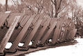
| good depth of field, nice composition, |
|
|
|
01/03/2006 07:24:19 PM |
| My personal preference would have been for a slightly longer depth of field. Perhaps 2 or 3 stakes instead of just one. I think it'd make for a more powerful image. |
|
|
|
01/03/2006 01:28:18 PM |
| This is a good idea for the challenge. I think if the DOF was deeper to show more of the top of the fence that it would illustrate a pattern more clearly. |
|
|
|
01/03/2006 12:46:58 PM |
| Love the composition on this one - the posts receeding into the distance, winter coats becoming a blur. So simple, too. |
|
|
|
01/01/2006 06:57:11 PM |
| good shallow depth of field |
|
|
|
01/01/2006 01:27:30 AM |
| Good concept for this challenge. I wonder if this shot would look better in black and white since the colors really don't add anything to it. |
|
|
|
12/30/2005 11:50:40 PM |
| I love the crystals on this posts......... |
|
|
|
12/30/2005 08:24:47 AM |
| would have been nice if the first one wasn't cropped off |
|
|
|
12/30/2005 07:18:03 AM |
| i like the DOF, but because of it, the pattern theme is missing - i think |
|
|
|
12/29/2005 08:12:10 AM |
|
|
|
12/29/2005 01:31:06 AM |
| I think it could benefit from a little more DOF, after all it is patterns and the added depth could give more continuity to this pattern. |
|
|
|
12/28/2005 11:20:32 PM |
| 6 - Nice. Criticism; 'if only' you had left the pattern of either the in focus 'post' (ie; it not cropped at the top and so tightly at the bottom), or else allowing more of the pattern of the 'others' to come into focus more, would have made this better in my opinion, but does of course deped on what you had to work with. |
|
|
|
12/28/2005 09:40:56 PM |
| I think maybe a greater depth of field would have improved this, as far as the pattern goes. It's VERY nice as it is, though. 7 |
|
|
|
12/28/2005 10:27:08 AM |
| Interesting and dreamlike. |
|
Home -
Challenges -
Community -
League -
Photos -
Cameras -
Lenses -
Learn -
Help -
Terms of Use -
Privacy -
Top ^
DPChallenge, and website content and design, Copyright © 2001-2025 Challenging Technologies, LLC.
All digital photo copyrights belong to the photographers and may not be used without permission.
Current Server Time: 03/12/2025 02:41:00 AM EDT.