| Author | Thread |
|
|
02/24/2006 10:39:30 PM |
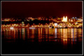
| When did u come to Varanasi? |
|
|
|
01/14/2006 03:04:19 PM |
::: Critique Club :::
Hi, my name is Kari and from the critique club.
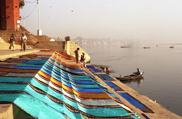
The critique I am doing is for "Washermanpet"
Great fun to do a critique on your image but it is difficult if you don't give us any information in your photographers comments. When we do a critique, we go past just the photographic result, that's what voters comments do. The critique looks at what you were trying to achieve, how you wanted it to look and what issues you had in getting the image captured and ready for voting.
First Impression - the most important one:
It made me glad to live in New Zealand ... look at that smog ... I love anything that makes me appreciate home.
Composition:
I like the way that this picture has leading lines taking the eye further into it.
Subject:
Does it meet hte subject. Well the city is in the background .. .the focus is not on that. It could be part of t he city, but it doesn't scream that ... but I felt that it was and that it did meet the challenge and personally marked it accordingly .. others may have had the same questions about "on challenge".
Technical (Colour and light):
I wonder if this could be sharpened .. or if by doing that it becomes too it becomes too granualted. I like the lighting in the picture .. and the colours, but I think the sharpness is what is letting it down. Also, I know this is a minor issue, but if when you resize it you do it to the maximum it helps with the impact on opening.
To grow its vote?:
A number of issues raised .. Shapening ... Size ... keep thinking about these are you shoot.
Summary:
I really like the photo during voting and I still like it. I wish I had more details for your picture and the story behind it as this would be cool.
If you've got any questions about this critique, please feel free to contact me via the PM system.
Cheers
Kari |
|
 Photographer found comment helpful. Photographer found comment helpful. |
Comments Made During the Challenge  |
|
|
01/10/2006 01:08:41 AM |
| Nicely done. Great cultural feeling from this picture. |
|
|
|
01/08/2006 09:50:50 PM |
| Unusual image, the color differance to the colorful foreground, between the smog background is unusual... |
|
| Photographer found comment helpful. |
|
|
01/07/2006 01:25:30 PM |
| To me, the picture just doesn't look as "clear" as it should. That said, it still works (just not as well as it might have). I'd like to give it a "6.5"...I'll flip a mental coin: sorry: "6." |
|
|
|
01/06/2006 02:40:53 PM |
| I like your use of colour, especially in contrast to the washed out grey-brown of the smog. |
|
| Photographer found comment helpful. |
|
|
01/06/2006 01:10:37 PM |
| Like the perspective and colors of the banners in the foreground but the 'city' in the background very hazy, hardly visible |
|
| Photographer found comment helpful. |
|
|
01/06/2006 04:59:23 AM |
| Could be a great photo, it is just not sharp enough, I think...some boost to color saturation would probably help too (6) |
|
| Photographer found comment helpful. |
|
|
01/05/2006 09:18:50 AM |
| shows beauty and labor/commerce colliding. nicely done. |
|
| Photographer found comment helpful. |
|
|
01/04/2006 08:58:56 PM |
| Composition is ok. The choice of subject matter is ok. The image quality is ok. Has potential of being really creative. -5 |
|
| Photographer found comment helpful. |
|
|
01/04/2006 04:38:52 PM |
| Very interesting subject, but appears to suffer a little blurriness due to shakiness or too shallow of depth of field. |
|
| Photographer found comment helpful. |
|
|
01/04/2006 01:54:44 AM |
| i love the colors in that material but the sky and water look too gray. good capture of city life though |
|
| Photographer found comment helpful. |
Home -
Challenges -
Community -
League -
Photos -
Cameras -
Lenses -
Learn -
Help -
Terms of Use -
Privacy -
Top ^
DPChallenge, and website content and design, Copyright © 2001-2025 Challenging Technologies, LLC.
All digital photo copyrights belong to the photographers and may not be used without permission.
Current Server Time: 03/12/2025 08:01:10 PM EDT.