| Author | Thread |
|
|
01/15/2006 03:22:06 AM |
Greetings from the Critique Club!
I am so glad I got this image as par of my assignment on CC! I loved this image, in fact this will not be the first comment you receive from me on this image.
This is really really slick manipulation of the camera to capture very subtle gradations of light. I can only wish for more info on how you came to this shot, or how you processed it (hint hint for leaving photog comments when you submit for an in-depth critique).
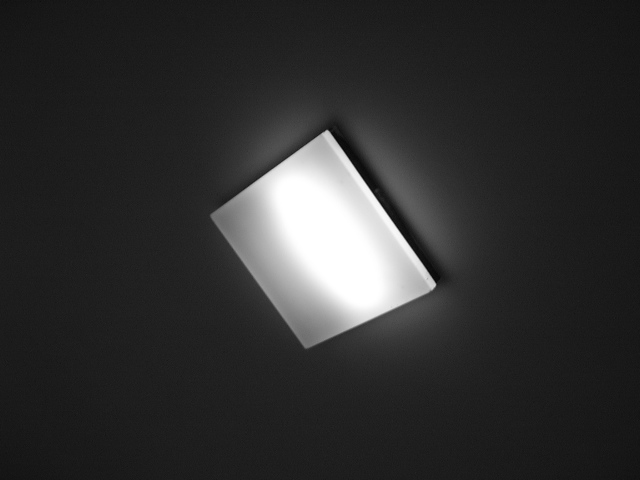
To be honest, I get a feeling of awe at how amazingly cool light is, even in it�s simplest forms. The bright spot gives me a reference of what the pure white level in this image is, and the shadow falling off the light fixture gives us a reference to the dark � although not quite black � aspects of this lighting.
I was about to add that pushing the shadow all the way to black would improve this, but I can�t bring myself to recommend this. It�s just too cool the way it is.
I�m a total sucker for the simple graphic look that can be achieved with photography. You�ve used that same look, but added those gradients that I go on and on about. Very cool.
And the angle of the light fixture in the composition brings energy where the possibility exists for static boredom. Excellent choice there.
Then look at the extrusion of the light fixture itself, that little edge defined so well by the shadow. But look closer, see the very delicate gradients at play in there � the grays in there are just enough to define the shape of the fixture, but also to further show the beauty of the lighting.
This shows a keen eye for lighting in the natural world that I hope to develop someday � I would love to just move through life and be aware of this kind of delicate beauty in the lighting around me.
So don�t let the voters bring you down � we both know that shiny-bright colors do best on DPC right? Go shoot more light fixtures in this style and create art for office buildings, or galleries. Three different kinds of light fixtures shot in this style hanging next to each other in a gallery would keep me entertained for a very long time (and my wife tugging at my sleeve to move along).
Usually I try to bring something out that could make the photo stronger � I�m seriously at a loss. In fact I�m sorry the challenge ended before I could revisit this and give it the higher score it deserved.
Regards,
Doug
|
|
 Photographer found comment helpful. Photographer found comment helpful. |
Comments Made During the Challenge  |
|
|
01/09/2006 04:19:57 PM |
| Very simple photo, as a result its not interesting. |
|
|
|
01/07/2006 04:04:56 PM |
| there isnt enough going on and its a pretty boring shot to look at, a different crop of more dramatic lighting would have helped |
|
|
|
01/07/2006 03:37:35 AM |
| Quite dramatic.....for such a simple shape. |
|
|
|
01/06/2006 07:06:03 PM |
| Nice gradation of light, cool b&w. |
|
|
|
01/05/2006 10:43:31 AM |
| Neat idea and IMO one of the few good takes on the challenge. Maybe next time move alittle off center and go after that hot spot in the center of the lught. |
|
|
|
01/05/2006 09:51:35 AM |
Good: diagonal orientaion
Less than good: centered composition, blown-out highlight, no real blacks
Would fixing these things make this a good photo? Probably for a "Minimalism" challenge, but not for "Shapes." |
|
|
|
01/04/2006 11:26:30 PM |
| the subtle gradations reached out and grabbed me, I hope others stop to appreciate the lighting - 7 |
|
|
|
01/04/2006 03:45:51 AM |
| I lopve this one, the deft minimalism of it. Lovely tones. I fear you are doomed, but wish you well, fellow-traveler. |
|
Home -
Challenges -
Community -
League -
Photos -
Cameras -
Lenses -
Learn -
Help -
Terms of Use -
Privacy -
Top ^
DPChallenge, and website content and design, Copyright © 2001-2025 Challenging Technologies, LLC.
All digital photo copyrights belong to the photographers and may not be used without permission.
Current Server Time: 03/12/2025 02:24:20 AM EDT.