| Author | Thread |
|
|
01/13/2006 09:31:09 AM |
*Greetings from the Critique Club*
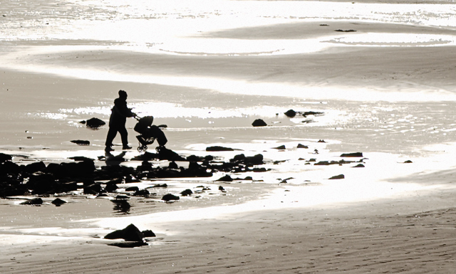
I really like this photo. It's strange because it's just so 'opposite'. It was interesting that you cropped it down from a much larger photo. Looking through your portfolio you have some work where you show a great eye for framing and the crop on this, in my opinion, is no exception. The nice rock in the foreground and the pattern of rocks leading to the sea help build the illusion that the person pushing the pram is walking toward the water where actually they are not.
As mentioned in a lot of your comments it's the blown highlights of the sun belting the water which I think cost this photo in votes. It just makes the image look a little bit harsh but at the same time, I could imagine this piece put back in the original photo which may paint a different picture. Maybe a polariser, as mentioned, would of made of a really different looking image?
The focus you have here looks good and the depth of field is great from front to back where you've cropped it from the larger file. The silhouette of the person with the pram is sharp and well placed in the frame.
All in all I liked the photo but it was just those highlights I think that cost you. Congratulations with your score and from looking at your portfolio you're in for a big year. Well done and best of luck!
Neil |
|
 Photographer found comment helpful. Photographer found comment helpful. |
Comments Made During the Challenge  |
|
|
01/08/2006 06:15:49 PM |
| The choice of subject matter is ok. The image quality is ok. The composition needs a little work. |
|
|
|
01/08/2006 07:06:15 AM |
| Strange. I've never seen anyone push a perambulator on a beach before. Nice silhouette but the patches of white are a bit burnt out. |
|
|
|
01/06/2006 07:32:03 PM |
| I love this one. I like your use of silhouette of the mom and stroller. |
|
|
|
01/05/2006 07:04:46 PM |
| The brights are a little too bright for my eyes, but I really like the abstractness of this. I like the way the sand merges with the water so that appears the pair is about to walk into the sea. Nice color choice, too. It's just those highlights that bother me, on this monitor at least. |
|
| Photographer found comment helpful. |
|
|
01/05/2006 05:00:42 PM |
| Nice idea. I wish there was less glare. A polarizer could have helped here. |
|
| Photographer found comment helpful. |
|
|
01/04/2006 10:25:48 PM |
| Very cool. They look kind of out of place which makes for an interesting image. Good composition too. |
|
| Photographer found comment helpful. |
|
|
01/03/2006 10:32:29 PM |
| I would have scored this higher but it seems a bit over processed |
|
| Photographer found comment helpful. |
|
|
01/03/2006 09:01:04 PM |
|
|
|
01/03/2006 10:50:34 AM |
| this is way too over exposed |
|
|
|
01/03/2006 06:56:22 AM |
|
|
|
01/03/2006 05:50:26 AM |
| I found this fairly compelling even at first glance. It just speaks volumes with so little information. The black and white is nice - it strips it down to just the necessary details. |
|
| Photographer found comment helpful. |
|
|
01/02/2006 11:35:37 PM |
| Beautiful photograph! Love the effects! |
|
| Photographer found comment helpful. |
|
|
01/02/2006 08:38:17 PM |
| nice image like the stark contrast |
|
| Photographer found comment helpful. |
|
|
01/02/2006 01:09:45 PM |
| Great image... I would love a tighter crop (to focus more on the mother and child), and I would love to have more detail in the water, too much blown highlights |
|
| Photographer found comment helpful. |
|
|
01/02/2006 11:20:02 AM |
| deserve to bee close to top |
|
Home -
Challenges -
Community -
League -
Photos -
Cameras -
Lenses -
Learn -
Help -
Terms of Use -
Privacy -
Top ^
DPChallenge, and website content and design, Copyright © 2001-2025 Challenging Technologies, LLC.
All digital photo copyrights belong to the photographers and may not be used without permission.
Current Server Time: 04/27/2025 05:24:50 AM EDT.