| Author | Thread |
|
|
01/16/2006 06:13:11 PM |
**** Greeting from the Critique Club ****
Challenge
- Relevant to the Challenge? Yes
- Is subject unique (vs. unoriginal or rehashed)? Yes
Compostion
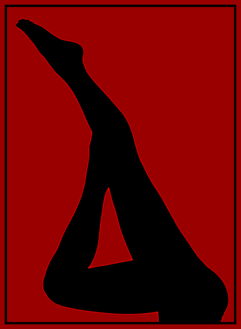
- Good or Bad? How can it be fixed? Nice strong diagonal elements. Very simple composition. Not too much that can be said here. :)
Lighting
- Good use of light? Yes. Nice silhouette.
Aesthetics/Artistic Appeal:
- Colors and Contrast Good color choice and contrast with the silhouette. Maybe make the red a few shades lighter.
- Sharpness. Okay. Here's the that I don't like. The over-sharpening. You like the halo. I would like it better without.
- What is my reaction or feelings? It grabs your attention. I took a copy of this and twiddle with it in PS and I prefer it with the edges soft. It's too harsh. |
|
 Photographer found comment helpful. Photographer found comment helpful. |
Comments Made During the Challenge  |
|
|
01/10/2006 11:38:18 PM |
| Like pop art. I would prefer a softer treatment but not to worry, the impact is very nice. Bumping up. |
|
| Photographer found comment helpful. |
|
|
01/10/2006 07:27:17 PM |
|
| Photographer found comment helpful. |
|
|
01/10/2006 01:50:43 PM |
| Reminds me of early James Bond movie intro... |
|
| Photographer found comment helpful. |
|
|
01/08/2006 09:15:27 PM |
| Superb placement and line. Very professional. Love it. Hope it does well for you. |
|
| Photographer found comment helpful. |
|
|
01/08/2006 04:26:30 PM |
|
| Photographer found comment helpful. |
|
|
01/07/2006 09:23:16 PM |
| very nice, superbly executed, the oversharpening works nicely for outlining...great sensual capture of the foot |
|
| Photographer found comment helpful. |
|
|
01/07/2006 04:26:12 PM |
| Dang, I really liked this in thumbnail, but I'm not sure I like the halo effect. That will keep it from a 9-10, but I'll still give it an 8. This pic is truly all about the shape. |
|
| Photographer found comment helpful. |
|
|
01/07/2006 01:49:30 AM |
| Another great strong bold silhouette here..... |
|
| Photographer found comment helpful. |
|
|
01/06/2006 11:52:11 PM |
| Oversharpening is usually distracting, but the high acutance works very well here. Great color choice too. |
|
| Photographer found comment helpful. |
|
|
01/06/2006 11:23:15 PM |
| I really like this composition but I don't really like the border you used I also don't like the bright red stroke going around the figure maybe it was sharpened to much just a guess. |
|
| Photographer found comment helpful. |
|
|
01/05/2006 08:41:32 PM |
| Wonderful capture, but you have to explain how you di it. I predict a top five, but what do I know. |
|
| Photographer found comment helpful. |
|
|
01/05/2006 08:01:27 PM |
|
| Photographer found comment helpful. |
|
|
01/05/2006 05:11:23 PM |
|
| Photographer found comment helpful. |
|
|
01/05/2006 10:10:00 AM |
| Very nice. The over-sharpening is a graphic element in itself. |
|
| Photographer found comment helpful. |
|
|
01/04/2006 07:14:55 PM |
| uh... hey baby, how ya doing? ;-) Very nice siloette. |
|
| Photographer found comment helpful. |
|
|
01/04/2006 02:50:35 PM |
| lovely profile. i like the red bg. |
|
| Photographer found comment helpful. |
|
|
01/04/2006 01:30:08 PM |
| Nice silhouette, but I don't like the bright edging. |
|
| Photographer found comment helpful. |
|
|
01/04/2006 04:54:42 AM |
| Clever and well executed, like the outline effect. |
|
| Photographer found comment helpful. |
|
|
01/04/2006 01:02:04 AM |
| Nice shot. I'd be interested to know how you achieved this effect... red lit background and extreme high contrast? |
|
| Photographer found comment helpful. |
Home -
Challenges -
Community -
League -
Photos -
Cameras -
Lenses -
Learn -
Help -
Terms of Use -
Privacy -
Top ^
DPChallenge, and website content and design, Copyright © 2001-2025 Challenging Technologies, LLC.
All digital photo copyrights belong to the photographers and may not be used without permission.
Current Server Time: 04/27/2025 05:19:04 AM EDT.