| Author | Thread |
Comments Made During the Challenge  |
|
|
01/10/2006 06:58:44 PM |
| Made me laugh, funny. Nice composition. |
|
 Photographer found comment helpful. Photographer found comment helpful. |
|
|
01/09/2006 10:06:45 PM |
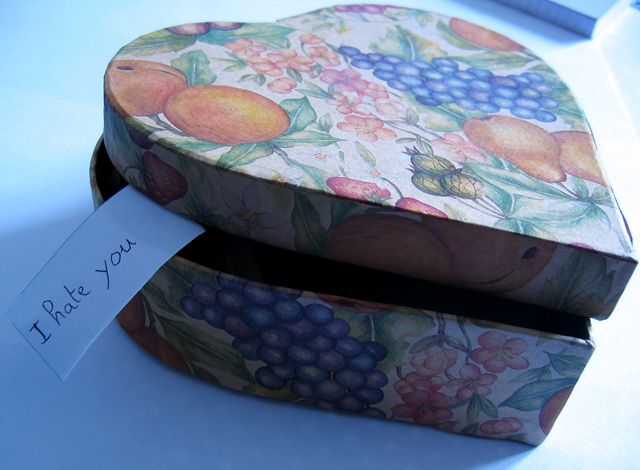
| For me, I find the object in the upper right detracts and maybe a different background, like black ? would help add to this photo. I do like how you have the paper tag coming out of the box. |
|
| Photographer found comment helpful. |
|
|
01/09/2006 05:04:12 PM |
| sometimes love and hate are so closely related. there's really not much too this photo. the tilting helps make it more interesting than it actually is. |
|
| Photographer found comment helpful. |
|
|
01/07/2006 11:16:10 PM |
Sorry, but there are just too many distractions in this photo.
The cropping around the main shape is very tight; the photo would benefit from some plain background space.
The floral pattern on the box takes away from the heart shape.
The object in the upper right corner draws the eye away from the central object.
The tag coming out of the box breaks up the echoing heart-shaped shadow from the box bottom.
And, the verbal message contradicts the visual message in a very distracting way.
If the visual distractions were removed, perhaps this could be an interesting "mixed message" photo... but as it is, the photo doesn't say "shape" to me. |
|
| Photographer found comment helpful. |
|
|
01/07/2006 02:07:56 PM |
|
| Photographer found comment helpful. |
|
|
01/07/2006 01:30:58 AM |
| The message spoils the image..... |
|
| Photographer found comment helpful. |
|
|
01/06/2006 11:09:33 PM |
| That's not very nice you don't even know me? |
|
| Photographer found comment helpful. |
|
|
01/05/2006 10:19:14 AM |
| Hmmmm..what's in the box? Rattlesnake, scorpion...? |
|
| Photographer found comment helpful. |
|
|
01/05/2006 09:41:23 AM |
|
| Photographer found comment helpful. |
|
|
01/04/2006 11:32:17 PM |
| Why? What did I do to you? :-( |
|
| Photographer found comment helpful. |
|
|
01/04/2006 11:07:52 PM |
| I didn't think the box was that great, but the little slip made it much more interesting! Maybe should have composed it so the notebook in the top corner wasn't showing? |
|
| Photographer found comment helpful. |
|
|
01/04/2006 10:19:46 PM |
| Nice irony, but I think the blue color cast detracts from the photo. |
|
| Photographer found comment helpful. |
|
|
01/04/2006 06:28:43 PM |
| Hate is bad................... |
|
| Photographer found comment helpful. |
|
|
01/04/2006 12:11:23 PM |
| The shadow cast in the front makes this look too snapshotty. A better lignting would have improved this image a lot. (E.g. having a sheet of white paper reflecting the natural light and illuminating the front of the box would have helped IMO). |
|
| Photographer found comment helpful. |
|
|
01/04/2006 09:55:25 AM |
| what's that thing in the top right? |
|
| Photographer found comment helpful. |
|
|
01/04/2006 03:57:15 AM |
| maybe that note should stay locked awat in that box and not allowed out |
|
| Photographer found comment helpful. |
|
|
01/04/2006 02:36:22 AM |
| Well, since you hate me I'm going to give you a low score! Just kidding! |
|
| Photographer found comment helpful. |
Home -
Challenges -
Community -
League -
Photos -
Cameras -
Lenses -
Learn -
Help -
Terms of Use -
Privacy -
Top ^
DPChallenge, and website content and design, Copyright © 2001-2025 Challenging Technologies, LLC.
All digital photo copyrights belong to the photographers and may not be used without permission.
Current Server Time: 03/12/2025 01:23:45 PM EDT.