Greetings from the Critique Club! :-)
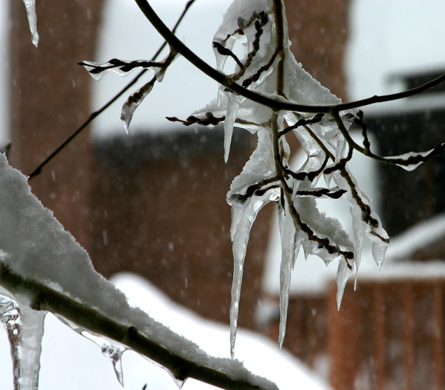
First of all , let me say this image has cold written all over it. The focus is spot on, and the long exposure accenting the falling snow is icing on the cake � this is a terrific take on the challenge � I especially like the fact that you thought �outside the box� of basic shapes and went for something more organic and complex. That kind of originality deserves to be commended.
Composition:
The main subject is spot on the rule of thirds, lending some nice composition to the image � if it was there by itself I would love it. The branch coming through the lower left corner has a lot of weight to it, it�s by far the thickest branch, it�s foremost in the z-plane of the photo, and has that darker snow on it. In other words there is a large object that isn�t your main focus of the photo that is really competing for my attention. In fact my eye calls it about a tie, and can�t figure out which one to look at until we look at the light and dark areas�
The lightest and darkest areas of your photo are definitely in the background. The black (or near black) space in the middle right and the bright full white snow in the lower left. This snow in the lower left is what pushes the branch in the lower corner into what my eye most wants to look at. Between the heft of the branch with the dark snow, and the stark contrast to the brightest part of the photo, my eye just keeps drifting down there.
Lighting:
One of your comments mentioned that it would be nice to have more light on the icicle itself. A difficult task given there�s usually not a lot of spare light in a snowstorm. But this does create the issue of the main subject of your photo being all 10% - let�s say 50% grey, while the big contrast comes from the black and the white in the background. All of this adds up to the icicle being just a little lost in there.
Ok, all of that having been said, let�s get back to the fact that you created a shiver of cold in me when I first saw the photo. So all that technical mumbo-jumbo aside, you created a physical and emotional response in me with your work. There�s a LOT to be said for that � to me far more important than white levels etc in my book.
Another thought I had, one that my clients like to use, is to tint the photo toward the blue side of the color wheel to further communicate the feeling of cold. I'm not sure it would make this better, but maybe it's something to consider? I throw it out there for what it is worth.
One more mention here. Your comments and camera data are very helpful when I�m working on a critique for CC. It helps me to know a little history of the photo, what you were thinking/going for when you took it, and f-stop would have been very helpful for some thoughts I had here too. So just a reminder, your comments help � a lot.
Once again, great work in creating a response in your audience. I�m looking forward to seeing more of your work in up-coming challenges.
Regards,
Doug
|