| Author | Thread |
|
|
02/01/2006 08:25:13 PM |
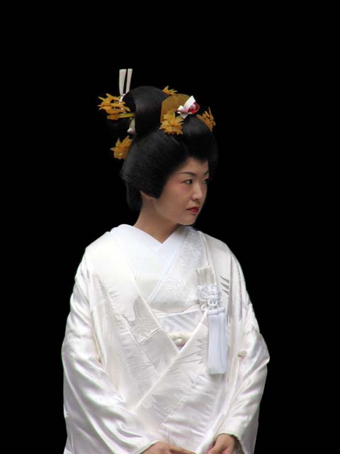
| Overall I like the shot, but there are a couple of things I would probably try to see how they look. I would crop much more off the top and a little more off the sides (zoom in closer). I would also try to burn some of her dress to bring out some of the detail & depth there. Last thing is run it through Neat Image to clean up the slight OOF/noise. Just some suggestions - not sure that any or all of them would help, but they might make it pop a little more. Currently it seems to lack a little luster. |
|
 Photographer found comment helpful. Photographer found comment helpful. |
|
|
02/01/2006 07:45:07 PM |
| This lady doesn't look impressed. Personally I don't like people photos very much - this one however is diferent. I think its the traditional wedding thing. Don't Japanese have aranged mariages? If so - the look says it all. |
|
| Photographer found comment helpful. |
Comments Made During the Challenge  |
|
|
01/29/2006 10:15:58 AM |
| Very interesting subject and very good control of the tonal range from those bright whites to the dark black in her hair. I think you could have cropped off some of the top, and I would like to have seen all of her hands. Still a wonderful image though. |
|
| Photographer found comment helpful. |
|
|
01/29/2006 05:52:29 AM |
| Perfect exposure along with all else! |
|
| Photographer found comment helpful. |
|
|
01/27/2006 12:03:50 AM |
| It looks like you've cloned out the whole background. |
|
|
|
01/26/2006 05:21:51 PM |
Very classy
Nice professional job |
|
| Photographer found comment helpful. |
|
|
01/26/2006 04:57:51 PM |
| nice capture, b&w great, excellent color, great light, no dof, excellent comp, overall a good pix |
|
| Photographer found comment helpful. |
|
|
01/26/2006 01:59:07 PM |
| This is a really nice shot, but I feel the crop has made this too centred. |
|
| Photographer found comment helpful. |
|
|
01/26/2006 08:34:23 AM |
| This make my heart melt, with sheer beauty..... |
|
| Photographer found comment helpful. |
|
|
01/25/2006 11:59:20 AM |
looks like the backround was once there and was taken away...its an odd blend the really white and the stark black.
if it were me i would have put her almost out of the frame 2 the left, so about half her body was in and you could see her stare across the black, it would be very striking that way. try a crop and then enlarge the canvis using black to that side...see how it looks. i don't know might not work at all, but to me center subject framing has is place and this doesn't hit it. very great capture tho. GL |
|
| Photographer found comment helpful. |
|
|
01/23/2006 09:58:01 PM |
| I would like to see either more or less of her hands--a tighter crop might serve you better, good job not blowing the whites and maintaining detail in the blac of her hair. |
|
| Photographer found comment helpful. |
|
|
01/23/2006 01:08:20 PM |
| And how many pounds does it weigh?! Beautiful. Just a wee bit too soft a focus. BOL |
|
| Photographer found comment helpful. |
|
|
01/23/2006 09:03:49 AM |
| Beautiful portrait. The colors are excellent. |
|
| Photographer found comment helpful. |
|
|
01/19/2006 08:44:06 PM |
| beautiful bride - I would have liked to see her looking at the camera |
|
| Photographer found comment helpful. |
|
|
01/19/2006 10:56:11 AM |
| The framing would be better if you could go back in time and tilt the camera down a bit and get all of her hands in the shot and eliminate some of the black space at the top. |
|
| Photographer found comment helpful. |
|
|
01/18/2006 10:13:08 PM |
| 9 from me....seems slightly blurry... |
|
| Photographer found comment helpful. |
|
|
01/18/2006 08:29:48 PM |
| I think there is a bit too much space at the top, and the left shoulder seems a little over exposed. I think a closer crop would have improved the photo a bit. |
|
| Photographer found comment helpful. |
|
|
01/17/2006 05:15:36 PM |
|
|
|
01/17/2006 09:55:32 AM |
I dont believe you just said that. No it is not a rug....
Look at that expression! She looks a lil peeved at someone, and you did a great job of capturing that. Good shot! |
|
| Photographer found comment helpful. |
|
|
01/17/2006 02:29:44 AM |
| this poor bride does not look very happy - she looks very nervous, almost like she wants to disappear. Nice focus. Might have considered not centering her so much. The lighting is very good as her hair has good texture to it and reflects just enough light. |
|
| Photographer found comment helpful. |
|
|
01/16/2006 10:34:45 PM |
| A little too much room to the sides and above for my liking...easily fixed with a crop though... |
|
| Photographer found comment helpful. |
|
|
01/16/2006 05:07:38 PM |
| Wow amazing shot, I love the contrast of the bridal outfit and the darkness of the backdrop. |
|
| Photographer found comment helpful. |
|
|
01/16/2006 11:27:27 AM |
| Nice color composition. A little bit of sharpening after the resizing would have help especially on the face. |
|
| Photographer found comment helpful. |
|
|
01/16/2006 03:42:36 AM |
| Excellent, but I think it would be even stronger with about 3/4 of an inch cropped off the top. |
|
| Photographer found comment helpful. |
|
|
01/16/2006 03:22:05 AM |
| The woman in the photo is a lovely model. However I think the composition would be greatly strenthened if the photo was composed as a head shot. I would have loved to have had a closer look at her facial features and the wonderful adornments in her hair not to mention that her hairstyle is of interest as well. A composition that tightly focuses just on her from her shoulders on up would capture and show us the beauty of this asian woman. |
|
| Photographer found comment helpful. |
Home -
Challenges -
Community -
League -
Photos -
Cameras -
Lenses -
Learn -
Help -
Terms of Use -
Privacy -
Top ^
DPChallenge, and website content and design, Copyright © 2001-2025 Challenging Technologies, LLC.
All digital photo copyrights belong to the photographers and may not be used without permission.
Current Server Time: 03/17/2025 09:42:21 AM EDT.