| Author | Thread |
Comments Made During the Challenge  |
|
|
01/17/2006 09:39:32 PM |
| Nice composition, combination of elements, and base colors. The colors look yellow, maybe different white balance or whiter lighting and more saturation would help? |
|
 Photographer found comment helpful. Photographer found comment helpful. |
|
|
01/17/2006 08:31:46 PM |
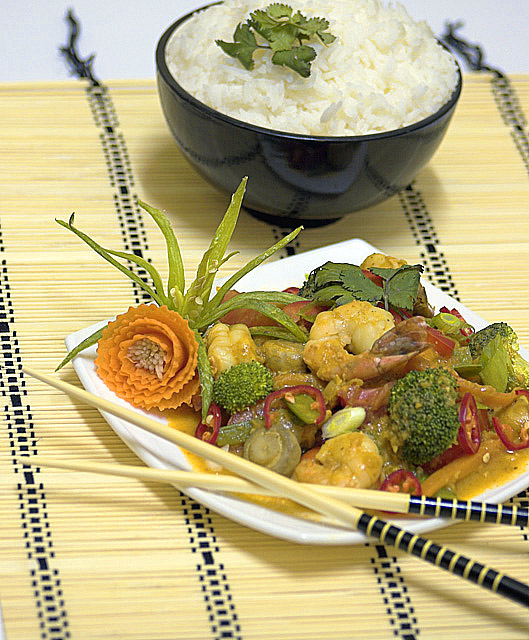
Looks yummy. :-)
A few critical suggestions on the image: (1) I find the cropping to be distracting -- I'd like to see all of the rice, and all of the dish... Having the chopsticks go off the edge _might_ be OK, and having the mat go off _is_ OK... I just wish to see all of the actual food, in this image. (2) it might also be nice if the depth of field were slightly deeper. Finally, (3) it seems that the colors look more muted than I imagine they would actually be -- it would be nice if they would really pop, particularly the reds of the peppers and the orange of the (beautifully done) carrot-flower.
Still, it looks tasty. I hope you enjoyed eating it. :-) |
|
| Photographer found comment helpful. |
|
|
01/17/2006 05:45:47 PM |
| Nice picture, good focus and appears to be a tasty meal at that. |
|
| Photographer found comment helpful. |
|
|
01/17/2006 03:50:05 PM |
| great shot...would like to see the chop sticks in focus...found ti distracting...but other than that...good enough to publish...7 |
|
| Photographer found comment helpful. |
|
|
01/17/2006 01:13:34 PM |
| Good arrangement and background. DOF is fine in this composition. The matching of the chopsticks with the mat works very well. |
|
| Photographer found comment helpful. |
|
|
01/15/2006 08:11:56 PM |
| Excellent presentation. I like the use of the mat on this photo, and the play of color use. Great detail on the food, as well. |
|
| Photographer found comment helpful. |
|
|
01/15/2006 04:16:32 PM |
| Food looks great. Place mat a bit distracting, |
|
| Photographer found comment helpful. |
|
|
01/15/2006 04:14:36 PM |
| This one is too cropped to have part of the dishes out. But I like the work on the picture that is inside the frame. |
|
| Photographer found comment helpful. |
|
|
01/15/2006 03:50:27 PM |
| The color looks a little flat. Maybe just too much yellow? Good Luck! |
|
| Photographer found comment helpful. |
|
|
01/15/2006 10:30:47 AM |
| that is so nice... I am voting with my taste buds... yum |
|
| Photographer found comment helpful. |
|
|
01/15/2006 07:11:33 AM |
| Delicious! I just hate shadows in food pictures. |
|
| Photographer found comment helpful. |
|
|
01/15/2006 12:52:26 AM |
| Very nice lighting and layout, but the greens look a little washed out on my computer. 9 |
|
| Photographer found comment helpful. |
|
|
01/14/2006 11:27:25 PM |
| Gorgeous! Yummy! Love the veggie origami. Maybe increase the sat a teeny bit. |
|
| Photographer found comment helpful. |
|
|
01/14/2006 10:49:55 PM |
| This is not only well photographed, but also very well presented..... |
|
| Photographer found comment helpful. |
|
|
01/14/2006 07:55:03 PM |
| nice composition and very sharp. |
|
| Photographer found comment helpful. |
|
|
01/14/2006 07:25:40 PM |
| I normally dock people for a distracting background, but in this case, it matches the chopsticks and makes for a visually appetizing treat. well themed and well executed. |
|
| Photographer found comment helpful. |
|
|
01/14/2006 01:52:14 PM |
| It seems that the coloring could have been punched up a bit; seems a tad dull.6 |
|
| Photographer found comment helpful. |
|
|
01/14/2006 11:13:10 AM |
| One of the most difficult things in food photography is to make the food look appetizing. I think you have accoplished that here. However, the composition is a little jarring and the lighting is harsh. A good start with a difficult subject. 6 - good luck in the challenge! |
|
| Photographer found comment helpful. |
|
|
01/14/2006 10:26:14 AM |
| Looks deliscious. Beautiful composition. I wish the lighting had been directed from the camera position, to avoid the shadows. 8 |
|
| Photographer found comment helpful. |
|
|
01/13/2006 08:38:00 PM |
| Good detail on the main course but a little more DOF maybe to the bottom of the plate would have worked better. Otherwise a great composition and presentation 9 |
|
| Photographer found comment helpful. |
|
|
01/13/2006 03:58:16 PM |
| I like the lower half of this image a lot. the upper...i find it unbalanced - move the rise to the left and lower so as not to crop off so much. also, the placemat ends and the strings dangle, drawing my eye away from the food on the plate. maybe could use a tad more contrast or perhaps sharpening to add some zing. |
|
| Photographer found comment helpful. |
|
|
01/13/2006 03:20:53 PM |
| Rice is a little blown-out, but the photo just works really well. Great job. |
|
| Photographer found comment helpful. |
|
|
01/13/2006 01:01:35 PM |
| I would have centered it a bit more, but I like the image. |
|
| Photographer found comment helpful. |
|
|
01/13/2006 12:30:32 AM |
| Beautiful presentation and composition!! I might suggest bumping up the saturation just a tad to enhance teh colors in the food. LOVE the flower on the main dish...just incredible! |
|
| Photographer found comment helpful. |
|
|
01/12/2006 06:20:55 PM |
| Very nicely composed. I might like the mat to extend all the way out of the frame, because it tends to draw my eye to the top of the image, away from the beautiful food, but other than that, it's quite lovely. 8 |
|
| Photographer found comment helpful. |
|
|
01/12/2006 12:02:06 PM |
good choice of colors, suptile setup, good focus, lower left corner(could've been cropped out...)
good luck |
|
| Photographer found comment helpful. |
|
|
01/12/2006 10:32:36 AM |
| I would have appreciated the bowl of rice not on the border ...Looks really tasty 6 |
|
| Photographer found comment helpful. |
|
|
01/12/2006 01:58:10 AM |
| Excellent one and crispy image quality. Regards, |
|
| Photographer found comment helpful. |
|
|
01/11/2006 05:51:56 PM |
|
| Photographer found comment helpful. |
|
|
01/11/2006 05:05:14 PM |
| The out of focus fringes at the back of the placement seem distracting to me |
|
| Photographer found comment helpful. |
|
|
01/11/2006 01:24:00 PM |
| Good composition and presentation, food looks delicious, one of the best in the challenge. |
|
| Photographer found comment helpful. |
|
|
01/11/2006 09:15:15 AM |
|
| Photographer found comment helpful. |
|
|
01/11/2006 08:25:24 AM |
| Bumping for sheer design. Great presentation, color and composition. Bumping. |
|
| Photographer found comment helpful. |
|
|
01/11/2006 06:12:49 AM |
| Sometimes it feels like every food featuring chopsticks is overly decorative. I like the appeal but dont know if thats meant for eating. |
|
| Photographer found comment helpful. |
|
|
01/11/2006 05:58:05 AM |
| i like this photo, vertical compo and "fresh" colors |
|
| Photographer found comment helpful. |
|
|
01/11/2006 12:21:48 AM |
Thai food. The food looks great and so is the presentation. Thai food is known for it's freshness, well at least in my family. I think the presentation is innovative in the sense that is has a fusion Chinese set up to it. Usually these dishes are not eaten with chopsticks, but with a fork and spoon. I won't judge on that. I think your focal point was the panang, but it somehow went out of focus around the huge broccoli.
The colour is very faded as well. Shaped carrots are very pale and look unappetising, so I'll throw a 7 your way for this. None the less the composition works very well. |
|
| Photographer found comment helpful. |
Home -
Challenges -
Community -
League -
Photos -
Cameras -
Lenses -
Learn -
Help -
Terms of Use -
Privacy -
Top ^
DPChallenge, and website content and design, Copyright © 2001-2025 Challenging Technologies, LLC.
All digital photo copyrights belong to the photographers and may not be used without permission.
Current Server Time: 04/01/2025 09:28:39 PM EDT.