| Author | Thread |
Comments Made During the Challenge  |
|
|
01/17/2006 10:06:14 PM |
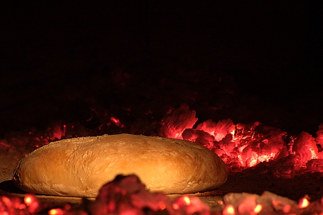
| Great idea. Bread shouldn't be blocked IMO. |
|
 Photographer found comment helpful. Photographer found comment helpful. |
|
|
01/17/2006 09:50:38 PM |
| Interesting photo nice lighting |
|
| Photographer found comment helpful. |
|
|
01/17/2006 09:36:24 PM |
| Nice sharpness, colors, textures, and lights from the coals. Less negative space and an additional element would help, maybe tongs? |
|
| Photographer found comment helpful. |
|
|
01/17/2006 08:16:40 PM |
| I really like this idea. Unfortunately, that one set of coals interupts the loaf of bread. I wonder what a higher point of view would have given you. |
|
| Photographer found comment helpful. |
|
|
01/16/2006 04:46:44 PM |
| Interesting concept and choice of coals color to support the idea. Some voters may feel there is too much black on the top of the frame and that the soft focused coal in front of the bun is more distracting than supportive of the theme. |
|
| Photographer found comment helpful. |
|
|
01/15/2006 11:10:25 PM |
| Not sure what it is.But it look good |
|
|
|
01/15/2006 04:15:16 PM |
| Beautiful picture but I feel that the red is a bit too red but it might be reality never the less. Great work. |
|
| Photographer found comment helpful. |
|
|
01/14/2006 11:02:23 PM |
|
|
|
01/14/2006 09:41:15 AM |
| Wow, that's an awesome photo. |
|
|
|
01/14/2006 09:10:06 AM |
|
|
|
01/13/2006 02:49:47 PM |
| This image stood out for me. Great interpretation of the challenge, well taken - lighting supurb. |
|
| Photographer found comment helpful. |
|
|
01/13/2006 01:45:16 AM |
It is "baked", ain't it? :-)
Good idea, I miss some more embers (unlike the dough I guess). |
|
| Photographer found comment helpful. |
|
|
01/12/2006 05:36:36 PM |
| Very clever photo, there is a lot of dark at the top but that's fine with me. The colors in the coals against the bread is very nice. 9 |
|
| Photographer found comment helpful. |
|
|
01/12/2006 01:09:34 PM |
| Would work better with a higher angle, colours look good. Too much dead space at top. |
|
| Photographer found comment helpful. |
|
|
01/12/2006 12:09:28 PM |
| you probably meant "baked"... original setup, lighting is ok,maybe tighter crop from the top? |
|
| Photographer found comment helpful. |
|
|
01/11/2006 05:06:49 PM |
|
|
|
01/11/2006 04:14:58 PM |
| This would have worked better for me with either more space above or below the bread. |
|
| Photographer found comment helpful. |
|
|
01/11/2006 07:21:03 AM |
| its a bit noisey and the composition isn't quite right - nice colours though. |
|
| Photographer found comment helpful. |
|
|
01/11/2006 04:44:30 AM |
| Uuu, this one's nice. I like bread. |
|
|
|
01/11/2006 03:58:23 AM |
| composition lets it down IMHO |
|
| Photographer found comment helpful. |
|
|
01/11/2006 03:23:06 AM |
| Try increasing saturation. It'll enrichen your bread color and intensify your coals. Great image. |
|
| Photographer found comment helpful. |
|
|
01/11/2006 03:17:03 AM |
| What is it? Some sort of bread? I like the colors the coals put off. |
|
|
|
01/11/2006 02:25:39 AM |
| Did you mean baked in hell? |
|
| Photographer found comment helpful. |
Home -
Challenges -
Community -
League -
Photos -
Cameras -
Lenses -
Learn -
Help -
Terms of Use -
Privacy -
Top ^
DPChallenge, and website content and design, Copyright © 2001-2025 Challenging Technologies, LLC.
All digital photo copyrights belong to the photographers and may not be used without permission.
Current Server Time: 03/12/2025 07:35:25 PM EDT.