| Author | Thread |
Comments Made During the Challenge  |
|
|
01/28/2006 07:43:17 PM |
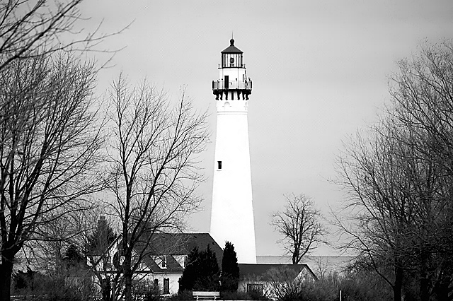
| nice idea, b&w need desperate help, your tonal values are off, textured whites and textured blacks are what you are after, nice comp, good dof, light ok, overall a nice try |
|
 Photographer found comment helpful. Photographer found comment helpful. |
|
|
01/28/2006 03:56:40 PM |
| The lighthouse is too centerd in this image and too white in my opinion. |
|
| Photographer found comment helpful. |
|
|
01/26/2006 03:24:27 PM |
| I think this could have been a better shot if you had composed the lighthouse tower off center (probably to the right to allow for the house on the left). Off center subjects are almost always more pleasing to the eye and brain then dead center. |
|
| Photographer found comment helpful. |
|
|
01/26/2006 08:23:48 AM |
| The tones really compliment this image..... |
|
| Photographer found comment helpful. |
|
|
01/25/2006 10:02:44 PM |
| beautiful. I love the pure white of the light. Which great lake are you on the shore of? Cheers from the west side of Superior. (well, somewhat near the west side...) |
|
| Photographer found comment helpful. |
|
|
01/24/2006 02:57:33 AM |
| I wish there were a little bit of ground showing under the house otherwise nice! |
|
| Photographer found comment helpful. |
|
|
01/22/2006 05:10:30 PM |
| Blew out the highlights on the litehouse. |
|
| Photographer found comment helpful. |
|
|
01/22/2006 01:08:39 PM |
| If anything, I would like to see this without the tree to the immediate left of the lighthouse, as I feel that it mars the composition somewhat. A bit too much to ask for, I know. |
|
| Photographer found comment helpful. |
|
|
01/20/2006 10:53:38 PM |
| i like how the lighthouse stands out |
|
| Photographer found comment helpful. |
|
|
01/20/2006 12:24:12 AM |
Which light house is this? I have some great shots of the Little Sable light house by Silver Lake Michigan...
TC |
|
| Photographer found comment helpful. |
|
|
01/19/2006 10:53:52 PM |
| Subject is centered and foreground is boring and cut off .Road or seashore as leading line would help. |
|
| Photographer found comment helpful. |
|
|
01/18/2006 11:58:56 PM |
|
| Photographer found comment helpful. |
|
|
01/18/2006 03:39:27 AM |
| I like lghthouses, and I like B/W's - just not such a bright white center point. All the detail is lost in the tower. |
|
| Photographer found comment helpful. |
|
|
01/17/2006 08:00:35 PM |
| I think the lighthouse being less centered would help the composition of the photo. |
|
| Photographer found comment helpful. |
|
|
01/17/2006 10:57:34 AM |
| Nice contrast and compostion! |
|
| Photographer found comment helpful. |
|
|
01/16/2006 05:50:02 PM |
| Lighthouse seems too white. Composition might be enhanced by cropping vertically with less stuff to either side of lighthouse but not centering the lighthouse. |
|
| Photographer found comment helpful. |
|
|
01/16/2006 11:13:47 AM |
| A nice scene, although the lighthouse seems to be a bit too centered, and the highlights are a little blown out. |
|
| Photographer found comment helpful. |
|
|
01/16/2006 02:51:47 AM |
| This is the classic shot for the lighthouse to be on thirds, and it is centred. |
|
| Photographer found comment helpful. |
Home -
Challenges -
Community -
League -
Photos -
Cameras -
Lenses -
Learn -
Help -
Terms of Use -
Privacy -
Top ^
DPChallenge, and website content and design, Copyright © 2001-2025 Challenging Technologies, LLC.
All digital photo copyrights belong to the photographers and may not be used without permission.
Current Server Time: 03/14/2025 06:24:05 PM EDT.