| Author | Thread |
Comments Made During the Challenge  |
|
|
07/14/2003 11:34:08 PM |
| Good job of showing the form. |
|
|
|
07/12/2003 10:57:04 PM |
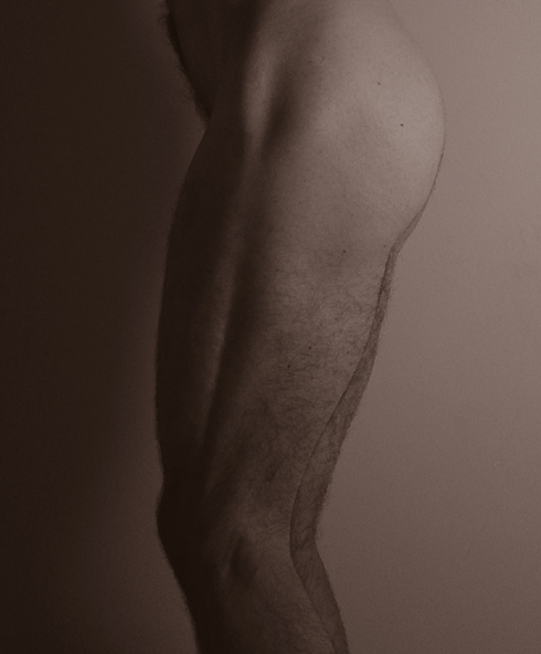
| I really like this shot a lot. I think perhaps it could be improved by playing with different lighting - perhaps more diffused lighting from each side, so that you'd still see the textures of the legs, but you'd capture more detail. As it is, I tend to squint at this, wanting it to be just a bit clearer, wanting the image to jump out at me a bit more. I'm glad that someone took an image of a man's legs, however. The muscle structure of a man's arms and legs are always amazing to me, as a female - strong, yet graceful lines. 7 |
|
|
|
07/12/2003 12:20:40 AM |
| would have liked to see all the way down to the feet! |
|
|
|
07/11/2003 08:10:17 AM |
| Great form. Looks like the bum should be the main subject, but the hair on the legs are really competing for my attention. Jacko. still a nice simple shot. Jacko. 8 |
|
|
|
07/11/2003 05:07:32 AM |
|
|
|
07/11/2003 03:52:45 AM |
| Subtleties of form and focus you have obviously grasped. Next step: Subtleties of lighting. A very good shot, ruined by being way too dark. Sorry. |
|
|
|
07/11/2003 03:07:07 AM |
| i'd like to see this a little more contrasty...some of the subtleties are lost. seems a little soft focus too, but that may just be the lighting. good composition. |
|
|
|
07/11/2003 01:32:59 AM |
| Seems too "monotone" to me. Needs more contrast (ie. lighter and darker areas). |
|
Home -
Challenges -
Community -
League -
Photos -
Cameras -
Lenses -
Learn -
Help -
Terms of Use -
Privacy -
Top ^
DPChallenge, and website content and design, Copyright © 2001-2025 Challenging Technologies, LLC.
All digital photo copyrights belong to the photographers and may not be used without permission.
Current Server Time: 03/12/2025 01:06:47 PM EDT.