| Author | Thread |
|
|
07/21/2003 10:10:27 PM |
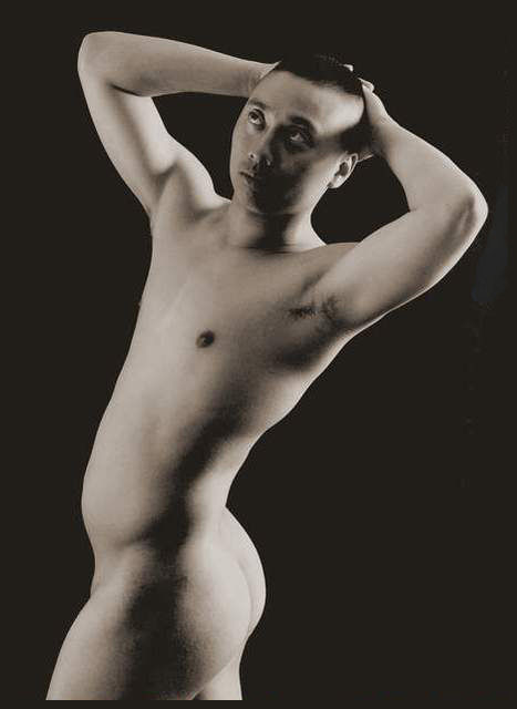
| pedro...I think the softness is grain from playing with levels. The image was actually underexposed. Also...my images look soft after compression and uploading to this site...i need to figure a way around such things. Not many people approve of his pose...perhaps i should title this one..."breaking the rules". Why must I conform to preconcieved notions of right and wrong poses? To me, it works for him. Journey put it together quite nicely...thank you journey :) |
|
|
|
07/18/2003 12:27:22 AM |
comment deleted
Message edited by author 2003-07-31 00:37:15. |
|
 Photographer found comment helpful. Photographer found comment helpful. |
Comments Made During the Challenge  |
|
|
07/14/2003 02:25:13 PM |
| I think this is the best image in this challenge. The vintage, fine art look that you have managed to creat with this photograph is exceptional. The tonal range and composition are all very complementory to each other. Congrats! |
|
| Photographer found comment helpful. |
|
|
07/13/2003 10:04:50 PM |
| I think I get where you are coming from for this shot... and please excuse me if I'm wrong, if I recall correctly there is some sort of a connection between being androgenous and reveared in some Asain cultures? Am I right? I think I remember that from my trip to Thailand/Mayanmar (Burma) but that was in 1998... anyway... This is nicely done... I like the lighting... I would have maybe gotten rid of the blue next to the person or your arm, but beautifully done, I also like the lightiness on the butt. Great photo... -9- |
|
| Photographer found comment helpful. |
|
|
07/11/2003 07:41:20 PM |
| The pose seems a bit awkward. I like how the shadows run down the center of the body and arms. |
|
| Photographer found comment helpful. |
|
|
07/11/2003 04:07:59 PM |
| this has a very old-fashionned feel to it. I like the lighting, and composition. there is some odd pixeliation at the edges of his body - wish you had edited out that odd shape behind his left shoulder. |
|
| Photographer found comment helpful. |
|
|
07/11/2003 02:03:59 PM |
| Nice pose and composition. Good shadows, except for the one on his face. Also, focus ia a little soft. |
|
| Photographer found comment helpful. |
|
|
07/11/2003 01:35:14 PM |
| funny pic, i like the framing and composition... i might suggest adding something small to make it more interesting... maybe a necklace? |
|
| Photographer found comment helpful. |
|
|
07/11/2003 10:37:32 AM |
| Yes, I see characteristics of both male and female......however the buns are all male. Neat idea, unusual. |
|
| Photographer found comment helpful. |
|
|
07/11/2003 07:49:34 AM |
| This is very nice. The only thing I didn't like was the shaddow cast by the model's arm across his face. |
|
| Photographer found comment helpful. |
|
|
07/11/2003 06:46:22 AM |
| though this was a brave shot.. like the grain in the flesh |
|
| Photographer found comment helpful. |
|
|
07/11/2003 05:00:43 AM |
| I think that you may have gone too far with your lighting of this picture - your blacks are too black where you lose any definition adn the whites are blown out - ie on the butt. However it is a nicely contrasted picture which offsets off the background. The pose is really good. |
|
| Photographer found comment helpful. |
|
|
07/11/2003 03:46:24 AM |
| Seems blurry and I am not too sure about the lack of light in his face. The pose also seems very unnatural, and a black border around a black picture seems to make very little sense. Cool title and good model, though. Perhaps the image would have more impact if he looked straight into the camera lens. |
|
| Photographer found comment helpful. |
|
|
07/11/2003 12:34:21 AM |
the lighting is a little off, and the pose looks quite un-natural (maybe that's what you were going for). I think you either shadow the face or don't - just the arm shadow messes the perspective up a bit.
**edit: still not even close to the best you've done of this subject (no offense intended). Now that I know it's yours I'm taking more time with it, and I still don't like the way that shadow draws a line on his face. The focus is a little soft...intentional to hide some skin imperfections? If I didn't know it was you, I would think some of these things were accidents...but I know your work better than that. As it happens I just don't agree with some of the choices.
P
Message edited by author 2003-07-21 21:44:54. |
|
| Photographer found comment helpful. |
|
|
07/11/2003 12:10:59 AM |
dude you look like peter lorre!
|
|
| Photographer found comment helpful. |
Home -
Challenges -
Community -
League -
Photos -
Cameras -
Lenses -
Learn -
Help -
Terms of Use -
Privacy -
Top ^
DPChallenge, and website content and design, Copyright © 2001-2025 Challenging Technologies, LLC.
All digital photo copyrights belong to the photographers and may not be used without permission.
Current Server Time: 03/12/2025 06:54:33 PM EDT.