| Author | Thread |
|
|
02/01/2006 02:08:54 PM |
Original picture:
 |
|
Comments Made During the Challenge  |
|
|
01/29/2006 06:52:07 PM |
| Great shot. I like the colors in this much better than the one that placed second in the old & new challenge. |
|
 Photographer found comment helpful. Photographer found comment helpful. |
|
|
01/26/2006 07:19:48 AM |
| This is really something, I love to know the story behind this image... |
|
| Photographer found comment helpful. |
|
|
01/24/2006 07:21:26 PM |
| Great lighting...super sharp...interesting perspective! |
|
| Photographer found comment helpful. |
|
|
01/24/2006 09:57:48 AM |
| Wonderful lines and shapes. |
|
| Photographer found comment helpful. |
|
|
01/20/2006 06:13:31 PM |
I remember this image.. a previous ribboneer.. still looking good, my images of the Louvre weren't nearly this good.
I would however like to see some natural skie colors above the pyramid. |
|
| Photographer found comment helpful. |
|
|
01/20/2006 05:33:51 PM |
| Another different take on the Louvre. Haven't seen it from this angle much. |
|
| Photographer found comment helpful. |
|
|
01/20/2006 03:25:25 PM |
| Neat! I love the different angles and curves. Border works well too. |
|
| Photographer found comment helpful. |
|
|
01/20/2006 10:39:01 AM |
|
| Photographer found comment helpful. |
|
|
01/19/2006 09:37:29 PM |
Deja vu! This looks like itsimring's red ribbon from a year ago... and I must say that it matches the quality, if not even compositionally stronger and with better lighting conditions.
I normally do not compare photographs, but this is so close to the other one that it just begs to be compared.
Expect high placement with this one. |
|
| Photographer found comment helpful. |
|
|
01/19/2006 07:35:45 PM |
| I have just one word for this.................WOW! |
|
| Photographer found comment helpful. |
|
|
01/19/2006 02:43:57 AM |
|
| Photographer found comment helpful. |
|
|
01/18/2006 04:56:56 PM |
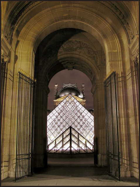
| I really like this symmetrical view of these two very different architectural works. However the yellow of the stone is a little unpleasant to me. Maybe converting this image to black and white would bring out the form elements and focus more attention on the lines. |
|
| Photographer found comment helpful. |
|
|
01/18/2006 01:35:54 AM |
|
| Photographer found comment helpful. |
|
|
01/17/2006 07:11:58 PM |
| Really nice shot! Maybe adjusting the levels a tad to get the shadows a tiny bit darker would increase the initial impact. 9 |
|
| Photographer found comment helpful. |
|
|
01/16/2006 10:32:25 PM |
| Excellent view of the I M Pei pyramid. Just excellent. |
|
| Photographer found comment helpful. |
|
|
01/16/2006 04:05:27 PM |
| kindof leans to the right, beautiful pic though 5 |
|
| Photographer found comment helpful. |
|
|
01/16/2006 03:11:37 PM |
| Great lighting and symmetry. This looks like something Itsimring would have done. Nice image. |
|
| Photographer found comment helpful. |
Home -
Challenges -
Community -
League -
Photos -
Cameras -
Lenses -
Learn -
Help -
Terms of Use -
Privacy -
Top ^
DPChallenge, and website content and design, Copyright © 2001-2025 Challenging Technologies, LLC.
All digital photo copyrights belong to the photographers and may not be used without permission.
Current Server Time: 03/11/2025 02:42:58 PM EDT.