| Author | Thread |
|
|
02/02/2006 04:56:42 PM |
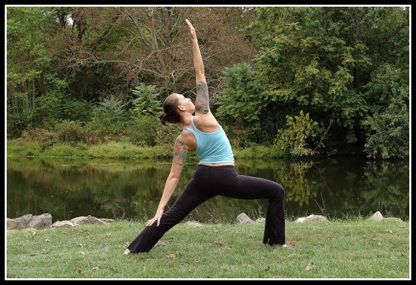
I would prefer it if she had faced the camera. It connects more with the viewer. The background is rather busy, so it draws some attention away from your subject. Maybe choose another bacground or throw it out of focus with a larger aperture. For me the centered composition doesn't work well, I'd prefer a more framefilling portrait view, also because she is pointing upward.
(this comment in reply to your forum question)
Message edited by author 2006-02-02 17:02:35. |
|
|
|
02/02/2006 04:54:20 PM |
| i think it is a visually appealing image, with lines and subject matter that makes you look a second longer. I am sure the next one will do better. |
|
Comments Made During the Challenge  |
|
|
01/31/2006 12:12:56 AM |
| Great looking image, my only comment is to have used a larger aperature to soften the background a little. |
|
|
|
01/29/2006 06:54:12 PM |
| Nice image. I'm curious how this would look in a vertical format because of the way her arms are positioned. This would work well in a brochure or advertising flyer. |
|
|
|
01/28/2006 10:19:36 PM |
| I think i've seen this before. nice contrast between "man and environment". |
|
|
|
01/28/2006 09:12:47 PM |
| Beautiful green colors, nice reflections. Good pose, her extended arm almost divides the picture, Well done. |
|
|
|
01/28/2006 07:57:10 PM |
| color a bit flat, nice lines, good texture, comp ok, light flat, I need to see the face to get a hint of emotion not the ass, dof ok, overall could be better |
|
|
|
01/26/2006 10:34:24 PM |
|
|
|
01/26/2006 02:07:21 PM |
| Like the countryside here, and she seems quite in focus, nice shot. |
|
|
|
01/26/2006 06:08:12 AM |
| Super reflection in the background, and this is a nomposed image... |
|
|
|
01/20/2006 05:14:26 PM |
| I think an off-center composition would have been awesome for this shot. Love the pose and the location. |
|
|
|
01/19/2006 09:12:57 PM |
| Nice capture. The serene background adds much to the composition. I would have been great though if you could have angled it so that dead tree didn't show right in the middle. 8 |
|
|
|
01/17/2006 10:45:50 PM |
| I think the centered position works well here, but I feel the hand is slightly too close to the top of the frame. I feel it should have the same amount of space, or more, than the space between the feet and the bottom. |
|
|
|
01/17/2006 03:41:22 PM |
| The model creates intersting lines and curves. I'm not one who feel centering is a bad thing, but I wonder how this would have been offsetting the model to the left some. |
|
|
|
01/17/2006 03:34:15 PM |
| A shallower DOF would have made your subject stand out from the background a bit more and helped the shot IMO. |
|
|
|
01/16/2006 11:55:29 AM |
| Good pose. I think it would be even more visually appealing if she were off to one side instead of smack in the middle (rule of thirds) |
|
|
|
01/16/2006 01:29:03 AM |
| love the tattoos....my favorite part!!! |
|
Home -
Challenges -
Community -
League -
Photos -
Cameras -
Lenses -
Learn -
Help -
Terms of Use -
Privacy -
Top ^
DPChallenge, and website content and design, Copyright © 2001-2025 Challenging Technologies, LLC.
All digital photo copyrights belong to the photographers and may not be used without permission.
Current Server Time: 03/12/2025 12:44:47 PM EDT.