| Author | Thread |
|
|
04/14/2007 07:59:28 PM |
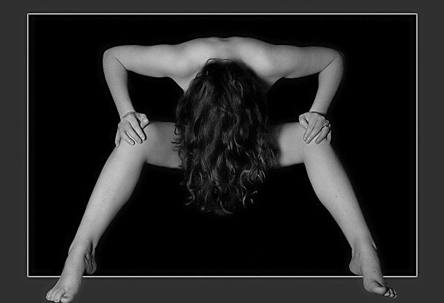
| I love the 3D effect created by her toes protruding past the surround. |
|
|
|
06/13/2004 09:17:06 PM |
|
|
|
04/26/2004 11:21:41 AM |
Check out this Stephen Lupino's photo

Amazing isn't it ?!?! |
|
|
|
02/26/2004 08:30:57 PM |
|
|
|
07/21/2003 06:48:49 PM |
| Very beatifull work. Simple and clean. Congratularions! |
|
 Photographer found comment helpful. Photographer found comment helpful. |
|
|
07/21/2003 09:31:01 AM |
Moved to photo comment, once I figured out how.
Message edited by author 2004-01-30 16:47:33. |
|
|
|
07/20/2003 07:26:06 PM |
| I think this should have been titled..."Hello in there." JUST KIDDING!! I like this pose, the lighting and the over all mood. |
|
| Photographer found comment helpful. |
|
|
07/18/2003 12:28:43 PM |
|
|
|
07/18/2003 08:44:04 AM |
| Nice photo! One of my highest rated this week (wonder why) :) The only thing that bothered me was the non-symmetric feet. |
|
| Photographer found comment helpful. |
|
|
07/18/2003 07:45:50 AM |
| good job. i actually thought this was joebar's picture. check out "Spooky" |
|
|
|
07/18/2003 12:50:04 AM |
| had i the courage to do nudes--this is the sort of thing i would do! love the pose and composition--'specially love the perfect lines formed by her body. lighting is superb. congrats! |
|
| Photographer found comment helpful. |
|
|
07/18/2003 12:32:25 AM |
| congratulations, Mario! beautiful photo! |
|
Comments Made During the Challenge  |
|
|
07/17/2003 11:30:45 PM |
| This image is my only 10 for the challenge! The composition is exceptional, as is the lighting , focus, etc. It is modest, yet interesting, but still naked! The limited digital art works very well here. I predict your image to win this week. Good luck and I hope it happens! |
|
| Photographer found comment helpful. |
|
|
07/17/2003 12:12:30 AM |
Ok this is my favorite photo this week. I love the symmetry of her shoulders and legs. The title says shy and having her hide her face and using her hair to hide her other unmentionables in this way complements the title perfectly. I love the sharpness of the photo and the ingenuous way of having her feet come out of the frame, which also complements the overall picture. I wish I took photos like this, perfect lighting, perfect focus, blah blah blah, I could go on all day. Well done a true blue ribbon! 10
Oh please make this available as a print I would love to have one.
|
|
| Photographer found comment helpful. |
|
|
07/16/2003 04:05:05 PM |
| Great lighing and composition. One of the few cases where a frame is used well - it give the picture a further dimension, the model is being viewed either from above or the front. |
|
| Photographer found comment helpful. |
|
|
07/16/2003 07:45:00 AM |
| Like the border effect. The concept of this pic is not portraying shy to me at all. I'm not particularly fond of this photo for this challenge. |
|
|
|
07/16/2003 01:10:06 AM |
| Excellent. I think you have a blue ribbom with this one. |
|
|
|
07/15/2003 10:24:56 PM |
| quite nice. I did a self portrait somehow similar to this...but different ;) Good job and good luck! |
|
|
|
07/15/2003 03:51:03 PM |
| okay....as a DPChallenge Submission.... it really work... |
|
|
|
07/15/2003 07:54:00 AM |
| One of the best shots of this week. No doubt, it´s a great job. Congratulations. |
|
| Photographer found comment helpful. |
|
|
07/14/2003 10:50:23 PM |
| Good image. The symmetry is intriquing. And this border actually works for this image! |
|
| Photographer found comment helpful. |
|
|
07/14/2003 02:26:52 PM |
| I like the framing. Clean lines |
|
| Photographer found comment helpful. |
|
|
07/14/2003 12:28:42 PM |
| i realize that you've probably heard about the border a million times by now, but i don't think that this photo needs one at all. -6 |
|
| Photographer found comment helpful. |
|
|
07/14/2003 12:13:36 PM |
| This is a great idea and a wonderful image. I like the tones and the symmetry, and the feet coming out of the border was a really nice touch too. It is almost like the person is coming out of the photograph. I'm not sure there is anything I would change or see negatively. I could see this hanging on a wall. |
|
| Photographer found comment helpful. |
|
|
07/13/2003 09:22:27 PM |
| This looks a lot like one of the photos I have on my favorites list Spooky by joebar. Very nicely done! I love the feet coming out of the frame... I'm guessing she was on a chair? I'm not sure someone could stand that way... but maybe. I love your black background and your lighting...very symmetrical and nicely done image. The only thing that somewhat bothers me about this photo, is the fact that all of your sides of your frame are equal except for the top one... not sure why you chose to do that? It bothers me quite a bit, and it detracts me from the photo, unfortunately I have to drop a point off for it... but it's still a 9 :-) Nice job! |
|
| Photographer found comment helpful. |
|
|
07/13/2003 03:28:16 PM |
| I like how the framing was done. The pose is nice and the shot turned out well. If the feet were symetrical it might have helped, especially since the frame draws attention to them. Nice work. |
|
| Photographer found comment helpful. |
|
|
07/12/2003 06:06:15 PM |
| Strong image, unusual pose, well done! |
|
| Photographer found comment helpful. |
|
|
07/12/2003 02:05:49 PM |
I pretty much like everything about this image.. technical and subjective..
I don't like how her right foot doesn't touch the border like the left one does, and I think she should have removed her ring(s). The body position creates neat geometrics. overall good work. |
|
| Photographer found comment helpful. |
|
|
07/12/2003 11:37:33 AM |
| Well done. This is in my opinion one of the top 3. I especially like the integration of the picture with the border. |
|
| Photographer found comment helpful. |
|
|
07/12/2003 09:45:04 AM |
|
| Photographer found comment helpful. |
|
|
07/12/2003 12:54:31 AM |
| I really like the strong sense of shape and symetrical nature of this shot. The exposure is also quite good with great shadow detail around the hands and great texture in the hair. |
|
| Photographer found comment helpful. |
|
|
07/11/2003 07:06:16 PM |
| Very nicely done! I lke the contrast brought about by the grayscale. Critiquie: Symetry seems to be the theme from top to.... almost the bottom. Everything is so symetrical until you reach the feet. |
|
| Photographer found comment helpful. |
|
|
07/11/2003 06:53:39 PM |
| great photo, i think color would add on impression it makes |
|
|
|
07/11/2003 06:05:41 PM |
| Great pose and very good use of a simple editing trick. But the grey halo around all the black areas (compression artifact?) is a bit distracting. |
|
|
|
07/11/2003 05:51:49 PM |
| I've seen a simliar posing before but this is as great too! 8 |
|
|
|
07/11/2003 04:47:19 PM |
| sorry seen this before.... |
|
|
|
07/11/2003 03:41:15 PM |
| Marvelously lit, imaginative composition. The feet poking out if fun/funny. But I do think it would work terrifically without that effect too. |
|
| Photographer found comment helpful. |
|
|
07/11/2003 03:38:44 PM |
| Stunning! The lighting, composition and balance are fantastic. I like the use of her hair as a focal point! Great job! |
|
| Photographer found comment helpful. |
|
|
07/11/2003 01:04:41 PM |
|
|
|
07/11/2003 11:11:16 AM |
| Great photo, but I don't care for the feet not being equally spaced from the frame. You pic is real symetric, so they should follow that theme. 8 |
|
| Photographer found comment helpful. |
|
|
07/11/2003 10:56:06 AM |
| I like the "stepping out of the frame" idea. I'm sure you'll get an equal number of people who say they hate it... but what're ya gonna do? :) I may have liked a little more space between her toes and the bottom of the shot, though. - 8 |
|
| Photographer found comment helpful. |
|
|
07/11/2003 10:40:27 AM |
Very strong shapes in this - and excellent pose to protect modesty whilst still conveying "nude".
I don't like the way that the border is slimmer at the top - I would prefer it to be uniform width all around, even though that's quite wide because of your decision to have the feet "fall out" of the border. |
|
| Photographer found comment helpful. |
|
|
07/11/2003 10:28:33 AM |
| Cute idea and well done. I like this very much. Crop is a bit tight at the bottom but I think you've done a nice job. |
|
| Photographer found comment helpful. |
|
|
07/11/2003 08:18:57 AM |
| neato. love the feet overlapping the edge of the frame . Maybe soften the edges of the feet a bit. Love the symmetry. Jacko. 10 |
|
| Photographer found comment helpful. |
|
|
07/11/2003 08:11:00 AM |
| good composition, like the feet going out of the frame |
|
| Photographer found comment helpful. |
|
|
07/11/2003 07:55:33 AM |
| The border is a neat affect but I find it distracts the eye from the subject. |
|
| Photographer found comment helpful. |
|
|
07/11/2003 05:23:32 AM |
| Interesting shot... nicely composed, I like the way her upper arms and shoulders mirror her thighs. Lighting is possibly just a little harsh for my taste. I like the way the feet break out of the frame, but I think there is too much tension in them... the ankles need to look smoother I feel. 9 |
|
| Photographer found comment helpful. |
|
|
07/11/2003 05:13:52 AM |
| love this image.. flesh tones are great.. texture in hair is spot on and I like the pose too..I like the symmetry.. so only possible quible.. it would have been good to have the feet in the same position as each other.. my only 10 |
|
| Photographer found comment helpful. |
|
|
07/11/2003 03:48:36 AM |
The border kind of works, but pulls the entire attention away from the picture itself.
It looks as though she is a readhead and has freckles on her arms. If this is the case, I would like to argue that you have wasted a model with infinite potential - get in close, show her characteristics.
When that has been said, I must say that you have chosen an unconventional way to hide her nude parts - which is cool. Not at all sure about the lighting, though. |
|
| Photographer found comment helpful. |
|
|
07/11/2003 02:23:08 AM |
| i like the border work, but it needs a little fix on the masking around the feet. Interesting pose as well, and lighting, etc. |
|
| Photographer found comment helpful. |
|
|
07/11/2003 12:35:33 AM |
| very sexy. love what you did with the border, even though many will chastise you for it. I think it's very appropriate. lighting is a little strong on the left, so it throws the balance off a bit. I like it. |
|
| Photographer found comment helpful. |
Home -
Challenges -
Community -
League -
Photos -
Cameras -
Lenses -
Learn -
Help -
Terms of Use -
Privacy -
Top ^
DPChallenge, and website content and design, Copyright © 2001-2025 Challenging Technologies, LLC.
All digital photo copyrights belong to the photographers and may not be used without permission.
Current Server Time: 03/12/2025 08:01:46 AM EDT.


 Shy
Shy


