| Author | Thread |
|
|
08/06/2006 03:01:53 PM |
| my wording in my last message was too harsh. your style is your style and the photo is attractive. it isn't anything like what i've seen Bernard do and i didn't word it correctly. i am sorry. |
|
 Photographer found comment helpful. Photographer found comment helpful. |
|
|
08/02/2006 06:06:19 AM |
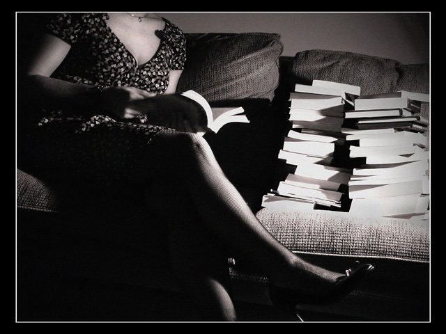
| i've taken three workshops with Bernard and produced three for him. i don't think that the photograph is anywhere near his style. the books are glaringly white and the leg of the women is too indistinct. i don't think that the photograph pays him very much homage. |
|
| Photographer found comment helpful. |
Comments Made During the Challenge  |
|
|
01/31/2006 11:32:03 PM |
| From what I've googled of Plossu, he creates striking abstract patterns, unlike what you've achieved here. I do, however, like your photograph for its own merits. The cutting off of the head to be replaced by a pile of books is simply brilliant. |
|
| Photographer found comment helpful. |
|
|
01/30/2006 09:05:06 PM |
I like the anonimity(?) of the cut off head.
I even like the too dark shadows by her legs and the blown out whites of the books.
strange that.
good work and good luck. |
|
| Photographer found comment helpful. |
|
|
01/29/2006 07:48:36 AM |
|
| Photographer found comment helpful. |
|
|
01/29/2006 03:51:35 AM |
| I love the mysterious feel of this image straight of out a Hitchcock movie set it seems. The BW and the frame really completes the success of this image. A bit dark at the lower left corner but I don't seem to mind. |
|
| Photographer found comment helpful. |
|
|
01/27/2006 07:52:59 PM |
| Has nice dark, rich tones like the referenced photographer. Maybe a bit too much light on the books but overall a pleasing composition! |
|
| Photographer found comment helpful. |
|
|
01/27/2006 05:09:57 PM |
|
| Photographer found comment helpful. |
|
|
01/27/2006 04:09:31 PM |
| i like the feel of this photo |
|
| Photographer found comment helpful. |
|
|
01/27/2006 04:04:18 PM |
|
| Photographer found comment helpful. |
|
|
01/27/2006 02:34:54 PM |
| Has an interesting feel, but lighting seems to obscure too much of her, while the books are well illuminated and sharp, drawing the eye away from her. |
|
| Photographer found comment helpful. |
|
|
01/27/2006 06:17:14 AM |
| Nice textures you´ve brought out.. |
|
| Photographer found comment helpful. |
|
|
01/26/2006 10:51:01 AM |
| Very nice lighting and great composition. Bumping up. |
|
| Photographer found comment helpful. |
|
|
01/25/2006 10:01:51 AM |
| Very chic. I love the dark contrast and the sexy line of the leg. Excellent. |
|
| Photographer found comment helpful. |
Home -
Challenges -
Community -
League -
Photos -
Cameras -
Lenses -
Learn -
Help -
Terms of Use -
Privacy -
Top ^
DPChallenge, and website content and design, Copyright © 2001-2025 Challenging Technologies, LLC.
All digital photo copyrights belong to the photographers and may not be used without permission.
Current Server Time: 03/12/2025 01:38:17 AM EDT.