| Author | Thread |
Comments Made During the Challenge  |
|
|
02/05/2006 11:40:02 PM |
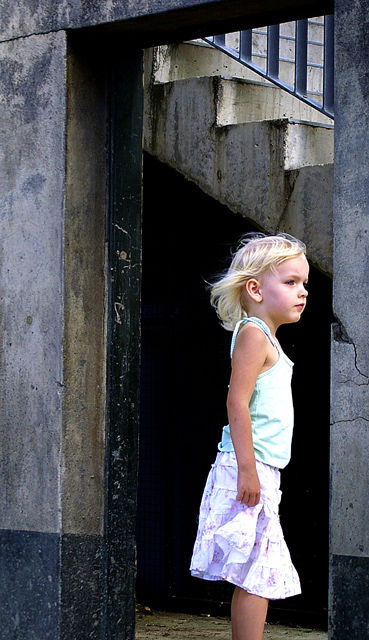
| for some reason I want to see her feet. Very cute image, love the wind in the hair and the angles of the doorway/stairs |
|
 Photographer found comment helpful. Photographer found comment helpful. |
|
|
02/05/2006 09:17:32 PM |
| I like your contrasts in saturation. Did you select the girl to achieve this? Hope to hear more. Nice light touch you took with this. |
|
| Photographer found comment helpful. |
|
|
02/04/2006 10:05:48 AM |
| I like the interesting background in this, makes me feel as though she is in a strange place and she is looking for something. |
|
| Photographer found comment helpful. |
|
|
02/04/2006 09:57:40 AM |
| The softness of the child, works so well, next to the sharp contrast of the background..... |
|
| Photographer found comment helpful. |
|
|
02/03/2006 10:18:43 AM |
|
| Photographer found comment helpful. |
|
|
02/02/2006 04:43:29 AM |
| gorgeous shot...a beautiful princess against a gritty background makes her beauty stand out even more...what a genius photographer! 8 |
|
| Photographer found comment helpful. |
|
|
02/01/2006 05:20:59 PM |
| You've put her head center (vertically) and cut off her feet! Everything else is great - love of contrasts between the girl (young, light, bright, soft) and the building (old, grey, darker, hard). I even like how she's looking around the corner to the short side of the frame. |
|
| Photographer found comment helpful. |
|
|
01/31/2006 11:21:27 AM |
| I like the dark shadows behind the subject, they make the subject pop. |
|
| Photographer found comment helpful. |
|
|
01/30/2006 06:01:36 PM |
|
| Photographer found comment helpful. |
|
|
01/30/2006 04:11:31 PM |
| Good picture but beed color adjustment |
|
| Photographer found comment helpful. |
|
|
01/30/2006 04:04:13 PM |
| Nice composition. The stairs at the background are a good choice. The detail of the wind gives another bonus point |
|
| Photographer found comment helpful. |
|
|
01/30/2006 01:49:21 PM |
|
| Photographer found comment helpful. |
|
|
01/30/2006 12:12:42 PM |
| Okay, if this subject needed to be off center, then you should give her space on the *right*, where she is looking, and not on the left. |
|
| Photographer found comment helpful. |
|
|
01/30/2006 09:37:07 AM |
| I think she would be better placed on the other side of the frame. |
|
| Photographer found comment helpful. |
|
|
01/30/2006 08:40:39 AM |
| There she is!!! She is the "bright spot" of this image, which I like. the hard angles of the doorway, with the softness of her hair is good. Seems a tad blown out on her shirt and skirt - probably due to their light colors. Still a wonderful image. |
|
| Photographer found comment helpful. |
|
|
01/30/2006 12:18:57 AM |
| Absolutely beautiful!!!! Great composition, the rose amongst the thorns. 10 |
|
| Photographer found comment helpful. |
Home -
Challenges -
Community -
League -
Photos -
Cameras -
Lenses -
Learn -
Help -
Terms of Use -
Privacy -
Top ^
DPChallenge, and website content and design, Copyright © 2001-2025 Challenging Technologies, LLC.
All digital photo copyrights belong to the photographers and may not be used without permission.
Current Server Time: 04/01/2025 09:14:35 PM EDT.