| Author | Thread |
|
|
02/11/2006 12:47:31 PM |
Originally posted by sfalice:
Greetings from the Critique Club
I see you have had some good comments through your Forum dialog, and I'm delighted to have the chance to add to them through the Critique Club as I have just drawn your image out of the queue.
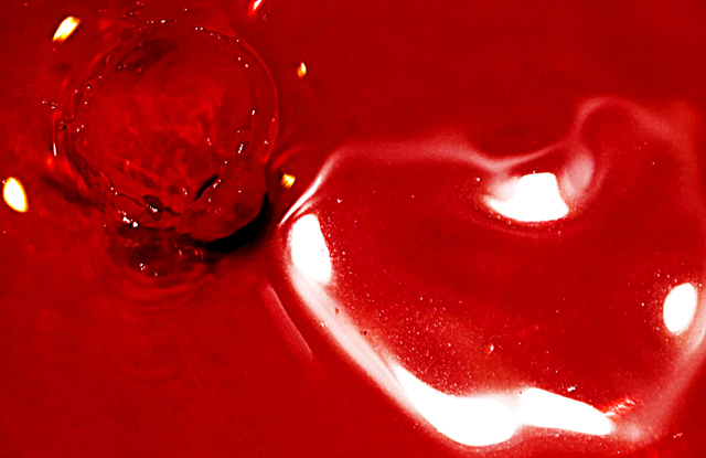
I think your Photorapher's Comment of "Last Minute Submission" may be the key to your rather low score on this bright image. It is rather difficult to tell just what the focal point of this image is and that always confuses the voters. Because you have several very white areas in your image, they tend to draw one's attention, but I think you want the viewer to look at the upper left corner where the stylized heart is.
I suspect that if you had had just a bit more time to work with this concept, and perhaps bracketed your shots, you might have come up with a composition that the viewers could appreciate a bit more. Bracketing might also subdue the very strong red - or the addition of just a touch of blue would also calm the color down a bit.
All in all, I think you just needed a bit more time with this one, and I'll look forward to seeing more of your work on DPC. Your other work tells me you have a good eye. |
Thanks for all your thoughtful comments. I'll be working on this one some more because I actually really love it. |
|
|
|
02/11/2006 12:05:33 PM |
Greetings from the Critique Club
I see you have had some good comments through your Forum dialog, and I'm delighted to have the chance to add to them through the Critique Club as I have just drawn your image out of the queue.
I think your Photorapher's Comment of "Last Minute Submission" may be the key to your rather low score on this bright image. It is rather difficult to tell just what the focal point of this image is and that always confuses the voters. Because you have several very white areas in your image, they tend to draw one's attention, but I think you want the viewer to look at the upper left corner where the stylized heart is.
I suspect that if you had had just a bit more time to work with this concept, and perhaps bracketed your shots, you might have come up with a composition that the viewers could appreciate a bit more. Bracketing might also subdue the very strong red - or the addition of just a touch of blue would also calm the color down a bit.
All in all, I think you just needed a bit more time with this one, and I'll look forward to seeing more of your work on DPC. Your other work tells me you have a good eye. |
|
 Photographer found comment helpful. Photographer found comment helpful. |
|
|
02/06/2006 10:46:38 PM |
| I find the title some what awkward, except for a reference between heart and red which makes a connection. Visually for me, more macro-medical and abstract than romantic. fyi - 5. |
|
| Photographer found comment helpful. |
|
|
02/06/2006 10:42:35 PM |
| At first glance it is hard to see what�s going on. I can see now that you were attempting the �splash� shot. Looking at it more closely it looks like you got a pretty good one but due to the angle�almost straight down�it is hard to see the splash in great detail for it blends in with the background. I think a different angle would have helped you in that aspect and also would have cut down on the glare of the flash, which is very strong and takes away a great deal from the subject. Like I said looks like you actually succeeded in getting a good splash but there were a few negative things that took away from it. I know these shots are very hard to get perfect and it takes many, MANY shots to get close to what you are looking for. Good luck if you ever try this shot again, and I know that next time it will do much better. |
|
| Photographer found comment helpful. |
|
|
02/06/2006 10:09:59 PM |
in the forums, you asked for an explanation of why some people (I) offered only a 1 for this image. For your request, I will offer you a stream of consciousness critique. Please, take this with a grain of salt. It is why I voted the way I did and I prefer bluntness to softening the message.
The image color is great! I love the pure red, however the image is only really strong in its coloration.
I found it hard to accept the form of the heart your title referred to, and found the blown highlights very distracting. Perhaps the sharpening or simply the lack of noise reduction caused it to appear grainy in some areas and flat in others. The level areas of the image come off as way too noisy.
I was impressed withe the splash detail, but found it too small to give much weight to its presence and when offset by the blob in the lower corner, found the whole to be compositionally unbalanced.
Water and other liquid images often suffer from oof. This one more so because the sharpest focus is on the splash and not the heart that your title refers to. Although the setup for this image may have taken considerable time and effort, it unfortunately comes off to me as a 'just take a shot and enter it' final product.
What would have made this image better?
* A close up of the splash
* A softer color (red especially on this site, tends to look the noisiest) perhaps pink or green (blue is way overdone)
* An angle that was lower, giving the splash more depth.
* A faster Shutter/ISO to give a crispness to an image that is in some ways emphasizing stop motion
* A smaller aperture to ensure clear focus on the entire image.
Once again. Please do not be offended by my commentary, these are my honest feelings, perceptions of the image and the reasons that I could not measure this image in the groups that made it to 2 or 3 or even higher.
Message edited by author 2006-02-06 22:32:42. |
|
| Photographer found comment helpful. |
|
|
02/06/2006 07:47:24 AM |
Originally posted by Zoomdak:
What is this? |
A blue berry thrown into water with red food coloring. The white/light areas around the "arrow" are reflections from over head lighting & the heart is from my flash.
|
|
|
|
02/06/2006 05:04:40 AM |
|
| Photographer found comment helpful. |
Comments Made During the Challenge  |
|
|
02/03/2006 03:30:52 PM |
|
| Photographer found comment helpful. |
Home -
Challenges -
Community -
League -
Photos -
Cameras -
Lenses -
Learn -
Help -
Terms of Use -
Privacy -
Top ^
DPChallenge, and website content and design, Copyright © 2001-2025 Challenging Technologies, LLC.
All digital photo copyrights belong to the photographers and may not be used without permission.
Current Server Time: 03/14/2025 06:27:10 PM EDT.