| Author | Thread |
|
|
02/11/2006 11:13:24 AM |
Greetings from the Critique Club.
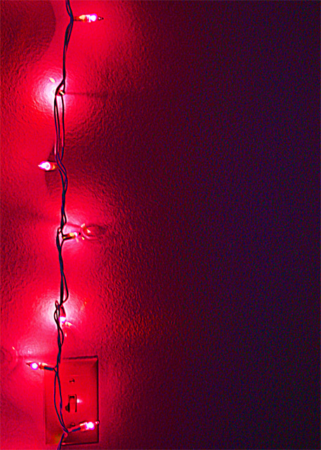
I like the simplicity of this photo. The lights bring out the texture of the wall and form an interesting shape. But it is lacking a good focal point; the light switch is too low in the frame to be one, leaving the rather vague shape cast by the middle light, which is in a good place but just isn't very interesting.
It also isn't clear to me what message this photo is trying to convey. Red tends to evoke passion and energy, but the vertical line of the wires with the sinuous swath of illumination behind it suggest something closer to harmony or confidence. Stringing the lights diagonally would better suit the red color, or a blue color would better suit the vertical lights.
But on the positive side, the technical aspects of this photo (focus, exposure, etc.) are great. And the negative space on the right which is dark but not completely black works very well. |
|
 Photographer found comment helpful. Photographer found comment helpful. |
Comments Made During the Challenge  |
|
|
02/04/2006 08:52:55 PM |
| This works well for me in this "Off-centered challenge", it would also be a good entry in a "Red Challenge"..... |
|
| Photographer found comment helpful. |
|
|
01/30/2006 01:20:23 AM |
| I think its the light switch that spoils rather than enhances this |
|
| Photographer found comment helpful. |
Home -
Challenges -
Community -
League -
Photos -
Cameras -
Lenses -
Learn -
Help -
Terms of Use -
Privacy -
Top ^
DPChallenge, and website content and design, Copyright © 2001-2025 Challenging Technologies, LLC.
All digital photo copyrights belong to the photographers and may not be used without permission.
Current Server Time: 03/14/2025 04:01:51 PM EDT.