| Author | Thread |
|
|
07/25/2003 10:16:36 AM |
<--Critique Club -->
Hello Sweet Sin,
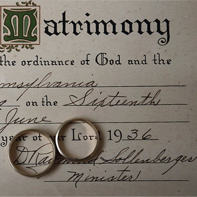
I like this photo overall. The certificate in the back and the rings look good and I like the texture of the paper a well.
I have to agree with some of the other comments however about the photo being kind of flat. Its not necessarily a bad thing but I think if you had adjusted the angle a bit down and to the left, it may have given more depth to the certificate.
The cropping is just a bit tight for my taste. I would like to see a bit more space next to the M on the left. Not centering matrimony but just giving a bit more room for it.
As an after thought perhaps you could show the color of the rings against the cert. Maybe getting a gleem or something.
I do like the photo and if you decide to shoot this again trying some different angles and lighting, I would like to see what you come up with, so PM if you do.
Good luck on future challenges.
Diversq
Message edited by author 2003-07-25 10:24:59. |
|
Comments Made During the Challenge  |
|
|
07/22/2003 11:37:07 PM |
| A very flat photo, some depth/perspective would have been better |
|
|
|
07/22/2003 12:06:08 PM |
| The tones here match the date well! Nice work! 9 |
|
 Photographer found comment helpful. Photographer found comment helpful. |
|
|
07/19/2003 11:47:16 PM |
| great idea! cropping is a little tight to the left for my taste and the shadows in the rings are a bit distracting...maybe one ring just laying over the other? good focus |
|
| Photographer found comment helpful. |
|
|
07/18/2003 06:20:13 PM |
| Good idea, but the photo comes out flat. There is no dimension to it. |
|
|
|
07/17/2003 10:45:30 PM |
| Unique take on this contest. You made a personal link for almost anyone that views this image (as most people have been married and, thus, have a marriage certificate. The focus around the top left corner seems a little mushy to me but that could just be the initial M and the way it was printed. |
|
| Photographer found comment helpful. |
|
|
07/17/2003 12:35:10 PM |
| good idea, but not the most interesting composition. |
|
|
|
07/17/2003 05:44:33 AM |
| beautiful subject and nice composition. |
|
| Photographer found comment helpful. |
|
|
07/16/2003 11:04:22 AM |
| Me likes whatcha done! :) I like this version a lot. |
|
| Photographer found comment helpful. |
|
|
07/16/2003 06:13:07 AM |
| Perhaps a slight angle would have given the rings a bit more character. At the moment the writing is holding too much attention. |
|
|
|
07/16/2003 03:13:31 AM |
| Classic photo one of my favorites,10 from me :-) |
|
| Photographer found comment helpful. |
|
|
07/16/2003 02:12:39 AM |
This is wonderful. The never ending symbolism of Love. What God has brought together may no man ever break apart.
|
|
| Photographer found comment helpful. |
Home -
Challenges -
Community -
League -
Photos -
Cameras -
Lenses -
Learn -
Help -
Terms of Use -
Privacy -
Top ^
DPChallenge, and website content and design, Copyright © 2001-2025 Challenging Technologies, LLC.
All digital photo copyrights belong to the photographers and may not be used without permission.
Current Server Time: 03/12/2025 11:32:29 AM EDT.