| Author | Thread |
|
|
07/08/2002 08:57:00 PM |
| Congratulations Gene - good job - 11th place... Steve |
|
|
|
07/08/2002 02:00:00 PM |
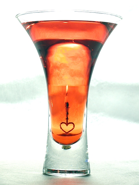
| Thank you everyone for your kind and helpful comments. As with every challenge, this one was a great learning experience for me. Sorry about the rotation, I really should have caught that and corrected it. I think that next time I will shoot only a few frames and then preview on the PC before making setup changes. I would like to hear how other people achieve perfection in their tabletop shots. |
|
|
|
07/08/2002 08:35:00 AM |
| this was one of the stand-outs to me, even with the slight tilt to right : ) |
|
Comments Made During the Challenge  |
|
|
07/07/2002 05:32:00 PM |
|
|
|
07/07/2002 09:49:00 AM |
| This is excellent. Perfect framing and composition, though the lighting on the background seems od (dark lines across the middle). |
|
|
|
07/05/2002 09:08:00 PM |
| i like the high-key surrounding the warm center. nice tones. |
|
|
|
07/03/2002 09:20:00 PM |
|
|
|
07/03/2002 07:08:00 PM |
| Excellent idea, very well executed. |
|
|
|
07/03/2002 05:56:00 PM |
| Lovely setup, good image. Nice use of props, background, and light. The line of dark liquid near the top is disruptive. You know, love is like this sometimes...a tiny little flame sunk into all the water of our defenses. |
|
|
|
07/03/2002 11:54:00 AM |
| I like it! I love the color and concept on this shot... I think the exposure may be a little hot, but the overall image impresses me quite a bit. The only minor details that I think could be better in this image are the exposure and the tilt to the right on the glass. Im guessin that correction on both of those would probably score an extra point or maybe two. Good shot! = 8 - jmsetzler |
|
|
|
07/03/2002 09:36:00 AM |
| Nice clear photo... good concept. Just a few nit picks: the figure is slightly leaning to the right so it could use a few degrees rotation, and that blue speck in the lower right hand corner is a bit distracting. |
|
|
|
07/02/2002 12:25:00 PM |
| Nice. My mind would like to see a continuum (sp) of reducing sizes. The whole image being one, the glass being the next, and the candle the last. Make sense? I think zooming out a little more would accomplish this. 7 |
|
|
|
07/02/2002 07:30:00 AM |
| Very beautiful! The only think I don't really like is the loveheart... it seems a little bit cheesy :P. But I'm giving it 10! |
|
|
|
07/01/2002 08:53:00 PM |
|
|
|
07/01/2002 04:43:00 PM |
| Very nice shot, jpretty well done. Kee |
|
|
|
07/01/2002 04:42:00 PM |
|
|
|
07/01/2002 04:13:00 PM |
| Sweet, but I think the background looks tooo blown out, esp at the top. Love the candle.....Photo 7 Transparency 9 total 8 |
|
|
|
07/01/2002 12:37:00 PM |
|
|
|
07/01/2002 10:07:00 AM |
| Great effect! Can't think of anything to change here. |
|
|
|
07/01/2002 09:46:00 AM |
| This doesn't look completely vertical to me. Still a nice shot, but I wish the top of the glass wasn't completely washed out in the center. |
|
|
|
07/01/2002 09:38:00 AM |
| Outstanding! Would have been even better if the rim had not washed out. I think either a black contrasty, or even a non-existant background would have added to this already super shot. |
|
Home -
Challenges -
Community -
League -
Photos -
Cameras -
Lenses -
Learn -
Help -
Terms of Use -
Privacy -
Top ^
DPChallenge, and website content and design, Copyright © 2001-2025 Challenging Technologies, LLC.
All digital photo copyrights belong to the photographers and may not be used without permission.
Current Server Time: 03/12/2025 07:59:17 AM EDT.